Sunday 22 February 2009

CEPT - Galaxy Rays Show

The Long Arm Gallery
Bridewell St, Bristol,
20 Feb - 13 March 2009


all photos: Howaboutno and NoLionsInEngland


It seems like moments ago that Cept and Mike Ballard got up with a joint show in a Dalston, London workshed yet here we are 4 months later and half a world away in former police station in Bristol for Cept’s new solo show.


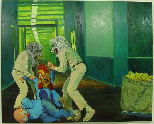
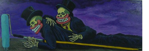
You’re nicked! – photo NoLionsInEngland


As in the London show, CEPT hangs gorgeous canvasses on the walls and indulges himself and us with a variety of mixed media installations. A vertical stack of TV screens inside a cage-door lift greets visitors timidly crossing the ex-cop shop threshold, flickering black and white film loops backed with crackling American voices issue barked ultimatums and set a jagged and staccato tone for the show.


photo: Howaboutno


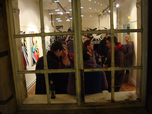
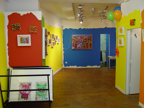
Those familiar with previous Christmas group shows at the Bridewell St police station will need to know that the cells downstairs are not in use, though the rooms that are open retain a strong institutional spartanism. The main gallery room is shared between a collection of canvasses and a swirling wall painting. The wall painting echoes the style of the Dalston illusion room but is a minor fanfare for the half height cubby hole entrance to the installation room beyond.
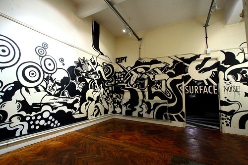
photo: Howaboutno
Neither the sharp lines of the wall painting nor the strong colours of the canvasses in the main space can explain the dissonant industrial hum that fills the space, it permeates through from the direction of the next room but the half height door ensures that there is no preview of what lies inside, so the process of entering the room maximises the impact.

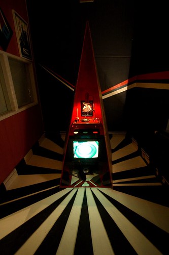
"Laplace Transforms" - photo: Howaboutno


Dalston’s illusion room was an empty and irregular shaped chamber twisted and distorted by Cept’s perspective juggling wall, ceiling and floor painting. This time, the space is filled by “Laplace Transforms” a bizarre sonic sculpture. Inside a glass fronted pyramid is a record player playing a piece of 7 inch vinyl literally to death – the needle has been replaced by a scalpel blade and a microphone picks up the scrapping of the record’s grooves, the signal passes through a voice changer and the amplified drone feeds back through the mic. In a cheeky nod to the artists’ graff origins the scene is illuminated by a spraycan lamp. It might assist interpretation to understand that Laplace transforms are mathematical operators that make differential equations even easier, used in among other things sound wave mechanics. Perhaps not.


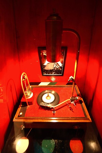
"Laplace Transforms" detail – photo: Howaboutno

The pyramid shape of the sculpture references the All-Seeing Eye. Galaxy Rays from the painting above the record player erupt out of the all-seeing eye, cross the floor of the room in all directions, and talk across the room to a painted Transformer Sun King, the clever link being Ra as all seeing eye linked to a Sun King, Sun-Ra being one of the artist’s fav jazz musicians.


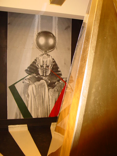
Sun King + Laplace Transforms– photo NoLionsInEngland

Whilst the eye takes in all the details and the mind spins, the ears start to pick up all kinds of slowly meandering harmonics in the audio. The gloom, the strong lines across the room and the textured relief in the floor all combine to knock senses off balance and make eyeballs pulsate, these effects are essential to the full immersive experience though you should bail before the diggery-doo aural illusion kicks in.

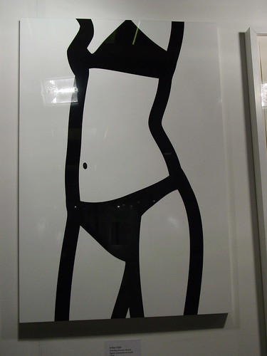
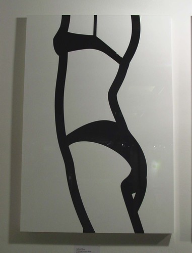
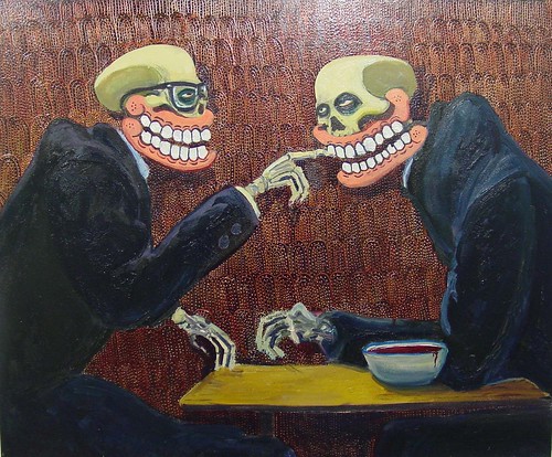
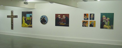
The main gallery contains a modest seven canvasses. The paintings are tense and dramatic and, with one notable exception, finishes are clean and glossy. The All Seeing Eye and Galaxy Ray motifs appear significant in several canvasses.


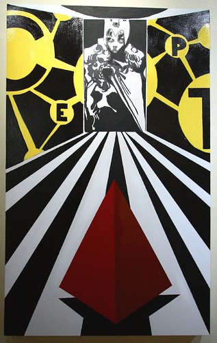
“Omega Supreme”, photo: Howaboutno

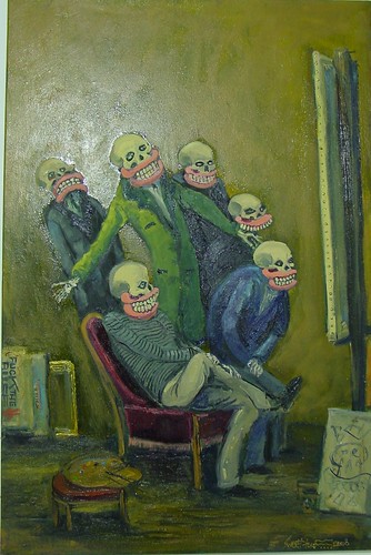
The Cept Super Villain’s spiral of despair continues, his face appears bleak and bitter, until he disappears in a series of body ripping explosions.


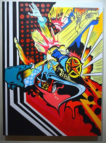
"The Cult Of The Explosion", photo: Howaboutno
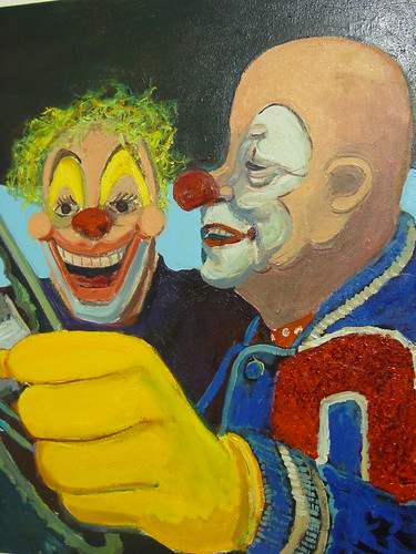
The exception mentioned is this gorgeously grimy Super Villain portrait.


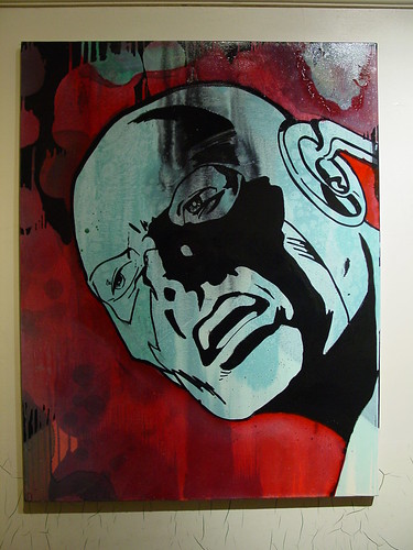
“Kyoto Crush” – photo NoLionsInEngland
A hunt through the adjacent admin office reveals a small number of painted album covers and a stack of prints and the installation room has a number of exercises in geometric patterns, and errrrr drips.

A flick through the pile of prints reveals a remarkable degree of individual variation thanks to the swirls of colour and bits of text added by the artist before the screenprint was applied, they look so varied as to be almost a numbered series of uniques.


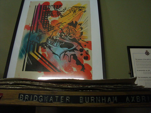
“The Cult Of The Explosion” print. – photo NoLionsInEngland


A personal favourite among the paintings in the Surface Noise room is Transit Minds, the pyramid picks up on the show’s theme of the Galaxy Rays source whilst drips which defy logic to run both up and down make the red strip resemble a fat, pulsing noise readout on an oscilloscope display.


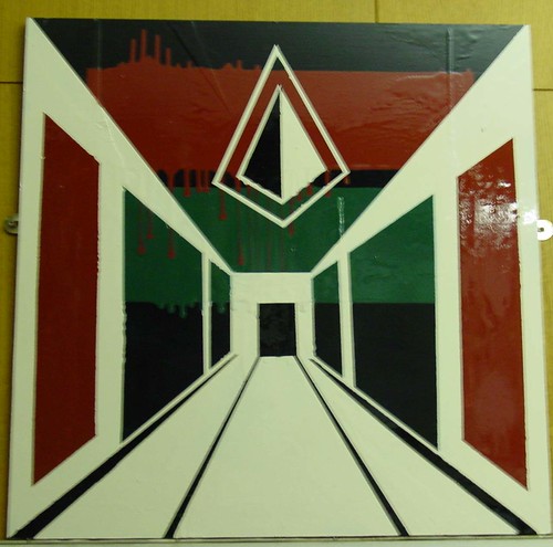
“Transit Minds” – photo NoLionsInEngland

We are getting accustomed to Cept’s shows having a coherence as a whole and an un-deniable beauty too, successfully differentiating him from most of the paint-drip-hang-sell urban artists. The bulk of the work connected with the show has been done after a short breather following the October show, Cept is un-doubtedly surfing a burst of creative power at the moment, let’s look forward to that energy being channelled back to the streets sometime soon.


Howaboutno’s photos are an institution. He should be in one. See more of his Cept Galaxy Ray photos here.

NoLionsInEngland's point and click pics from the show are here.

Sunday 15 February 2009

Bortusk Leer/Five Four (joint show): Cheer Up You Rotters

Brick Lane Gallery, London
5 – 16 Feb 2009

photos: NoLionsInEngland except donnierobot and Prescription Art where stated

Some Street artists wouldn’t be seen dead at their gallery openings. Some artists grudgingly turn up, mix with their mum and their crew and mumble “cheers my dears, been doin’ it for years”. Some front up with a natural effervescence that just explodes in everything they touch. And they would be jealous of Bortusk Leer’s off-the-scale panache.

Bortusk Leer’s fluorescent naïve-cartoonish monsters are now a familiar part of the urban decor through-out London’s East End but the street paste-ups are no preparation for the explosion of colour and nursery wackiness that characterises his second joint show, this time with mots-deux specialist Five-Four.


Just to recap, Bortusk Leer started under the Thinkfly pseudonym pasting colourful pigeons on newspaper, morphed into Bortusk with those un-mistakable childish monsters, surprised us with his Supine/Chapman-esque (Jake and Dino, not Mark) defaced vintage prints at his spring 2008 Viola Gallery (dec’d) joint show with Eefos (later to morph into Shuby) then branched his characters out into zany TV quality reality-cartoon montage video shorts and most recently provided regressive urban art affecionadoes with a darts-at-balloons lottery at London’s 2008 Urban Art Awards.

Brick Lane Gallery has been given a nursery make-over to host a primary colour fantasy crèche appropriate to the work of Bortusk Leer.


Photographs from the opening night are worth hunting out, showing Bortusk Leer as his larger then life self providing the kind of entertainment west London parents pay a small fortune to provide birthday parties for their kindergarden kiddies.


photo: Donnierobot


The presence of a wendy house – hang on, isn’t that soooooooooo December 2008? – provides a dayglo habitat for several nightmarish stuffed puppets and assorted characters.


Bortusk Leer/Tony Tagliamenti


Large canvasses provide a cluttered montage of childhood memorabilia with tightly packed toy plastic toys, imitation pistols and even a number of the defaced pictures complete with frames as seen at the Viola show. Incorporating textured letters, splatters and drips of paint, fragments of tagged wallpaper, sprayed monsters and toy detritus, a Bortusk Leer canvass has everything and the kitchen sink thrown in, though an hour rooting around under a nursery bed might deliver a similar effect.


Bortusk Leer: Cheer Up


The wild collision of colours and textures deliver a kaleidoscopic vision of a world seen through acid-fried juvenile eyes.


Bortusk Leer: Toy Story (detail)


A shelf of small sculptures resemble an identity parade line-up from a Frankenstein nightmare, showing a scary disregard for conventions of limb functionality, symmetry or compatibility.


Bortusk Leer: The Usual Suspects


The highlight of the show is what can only be described as a Bortusk Leer performance. Aided and abetted by the Muck Cake Sellers distributing grotesquely coloured Styrofoam muffins to the crowds, Leer gleefully beams across the room like the sun has come to a wintery Brick Lane. Infectious happiness and enthusiasm is irresistible, well certainly after a few opening night refreshments it is.


photo: Prescription Art


In case you wonder what a Muck Cake is, check the hair bobbles here.


photo: Prescription Art


Five Four makes an equally colourful contribution to the show, his oil painted mots-deux on paper collage, squeezed straight out of the tube and left for months to dry on the canvas result in a tubular multi-coloured micro-pollackesque text form. Previously these canvasses used to be left around the streets of London, it was always Five Four’s intention that they should be relocated a happy home.


Five Four


Words pairs are random but the pairings, apart from two exceptions they are pairs, manage to be paradoxical or just plain bizarre. The art though is really in the sumptuous bleeding of colours betwixt the layers of oil. The psychedilia in the colours complements the insane fruitiness of Bortusk.


Five Four


Experiments with lightboxes to enhance the lushness of the colours aren’t entirely successful, areas of white colour look as if a deeper colour has flaked off whilst darker areas don’t allow sufficient illumination to bring out the richness of the colours.


Five Four


You can’t make brilliant art out of shit ideas but strong concepts can build
noteworthy art with even the most rudimentary execution, critics of the child-like stylism in Leer’s work should go to this show to sample the elevating effect the work possesses.

More really great pictures can be seen on the photostreams of Prescription Art and donnierobot.
For more pictures of the art and artifacts, check Bortusk Leer and Five Four

Sunday 1 February 2009

Brad Downey – “An Honest Thief”


Presented by Stolen Space
Old Truman Brewery, London
29 Jan – 8 Feb 2009


Ever been jealous of someone’s lateral vision, been envious of the gift of conceiving and executing simple, subverted variations to the street scenery around us? If you’re an ordinary guy and have come across Brad Downey’s street art – then the answer is probably yes and yes again.

However, have you ever been let down by your heroes or disappointed by the mediocre achievement of a show hyped up by your own expectation that the street work is somehow going to transpose to a white box gallery space? If you go to Brad Downey’s first solo UK show in Stolen Space, London, then again you may find yourself ticking yes several times.

Brad Downey fine reputation is due mainly to his powerful and bizarre street installations. Downey takes the power of the streets, quadruples the source and hurls it back at the authorities who provide the arena within which he works. There isn’t a road marking, street sign or rotating object (!) which is safe when Downey’s in the mood for an audacious installation.

To stage this show, Stolen Space has moved about 20 yards down the Truman Old Brewery to a venue about, and don’t get too precious about the multiple, say 4 times the size of their own permanent gallery space. Downey has installed two prominent features, both at heart are disappointingly familiar. Along two sides of the room are four screens showing looped clips of Downey’s trademark street installations.


The clip of the rotating advertisement hoarding which winds streams of coloured tape off spools on nearby improvised spindles illustrates the his ability to create something simple yet so unexpected as to be initially baffling to the observer, forcing the passer-by to deal with multiple confusions such as was this part of the designed purpose, if not why has someone done this, can you walk past it safely, what will happen at the end and so on. A replay of the tube station turnstile installation would have been even more impressive. The three other looped films (Scaffolding love heart, jumper coinciding with building flashing lights and paving stone domino tumbling) were all played at Downey’s talk as part of Tate Modern’s 2008 Urban Art programme.

The second major installation was the street sign sputnik cluster, an idea executed and shown previously. In this case, it was actually awkward to view that piece in a way that might do it justice as every sightline seem to be compromised by either pillars or an un-sypathetic background.


Downey’s street sign work strongly echoes the efforts of UK artist Michael Pinsky, or is it the other way round – I’m not sure but I bet Pinsky gets a damn sight more public funding than Downey.

The limited number of gallery works were sparsely scattered around the periphery of the room. In one corner, juxtaposed against a small screen showing of a DVD of “actual police violence” were two sets of editioned deformed “night sticks”. A pair of seal like canoodling objects ask allegorical questions of love and romance in a world of state approved brutality whilst the single stick hanging flaccidly over the edge of its plinth drew a parallel with the big car-small dick use of macho objects as symbols of virility and power.


Night Dick On Limp/Night Dick In Love (behind)

Obviously the pieces look very well made but the most thought was why should the word truncheon be so sensitive that in the US it needs to go in disguise as “night stick”.

A vinyl copy of the Rolling Stones double Album Beggars Banquet, the one with the graffiti’d loo on the cover, had “Downey Was Not Here” added over the picture in white paint. The artist has deliberately not integrated the added graffiti into the picture which actually is stating the bleeding obvious as the album was released long before he was born, but the idea plays with Downey’s own “Brad Downey Was Here” tagging campaign, which on the street captures the essence of graffiti at every level.

A 20cm circular tapestry weave feature graffiti style motifs, with the square composition curiously off-centre and partially obscured by the tapestry frame. Evidently tapestry embroidery is becoming this year’s painting on perspex which last year was that year’s found metal (see also: DScreet).


V Fresh

Other items include a trio of animal images superimposed on another animal’s skin a continuation of a familiar series and a child crossing sign in which the figures are escaping from the frame.


Animals That Crossed
And that really is about it, other than a set of framed signed photos of selected street installations from the Downey cv, photos of which can be readily found on the internet.

The flaw with the show is that Downey’s work is best done on the streets and best appreciated on the streets, that’s what street subversion is about. The show is a reasonable Downey primer for Vyner St and Cork St types, if any retain any curiosity about urban art. Maybe the sense that an artist has passed off a show which has required almost no stretching of his undoubted talent and shameless exploitation, indeed repetition of previous pieces will dissipate over time.

PS: no link to a flickr set of other pictures from the show, that’s yer lot. I’ve never photographed a Downey on the street other than his tag, so let me recomend that you would be far off better visiting his site to see a comprehensive history of some stunning street installations.

Thursday 15 January 2009

London Art Fair


London Art Fair
Islington
13 Jan - 18 Jan 2009

Went to London Art Fair tonight, optimistically hoping to find some inspiring and directional contemporary art prior to optimistically popping out to watch Southend beat Chelsea in the cup replay.

London Art Fair isn’t the kind of “annual fair” that is going to have Heathrow flight marshals working overtime. In these austere times its hard to imagine too many hedge fund riche schlepping over from even Mayfair. London Art Fair is to Freize as Margate is to Monaco.

Mark Demsteader was probably the only fuse-blower for me. The pastel and collage and oil and collage images, and a load of the un-hung stuff looked stunning. Very Micallef in some respects. The collage element amounts to rough cut blobs of paper sparing applied on the picture, then drawn over, the paper looked possibly hand made, very coarse. The collage elements provoked a lot of close peering, as they added relief to the surface but nothing to the composition.


Mark Demsteader - Natalie Reclined On Green


Mark Demsteader - Natalie Seated Looking Up


Julian Opie was dotted around on several stands, this pair of screenprints on acrylic on Dominic Guerrini Fine Art looked gorgeous but the ones that really had me panting were a series similar looking triptychs described, if memory serves, as flocked acrylic. Sure enough, close scrutiny suggested that the figurative black outlines had been rendered by compressing fuzzy-felt under glass.


Julian Opie - Watching Susan (Front)


Julian Opie - Watching Susan (Rear)


Another piece to catch the corner of the eye was this tasty and colourful romantic urban pop fusion by Michael Victor presented by Bath based Edgar Modern. For once the drips manage to avoid looking too deliberate. The Bath bit is important as we watched them wheel out from under the table a hideous allegedly Banksy stencilled helicopter on a framed piece of plaster. Compositionally, Static would have blushed, it was truly dreadful. We listened somewhat agape as the gallerist assured an enquirer that his stuff on walls was more valuable than his studio stuff. Yours for thirty odd grand, provenance to be questioned!


Michael Victor - Diva


For anyone who cares, had a peek at Black Rat’s new Nick Walker print, I liked the fact there was a touch of blue in the sky which the London Morning After lacked.

The beauty of wandering around this sort of show where 99.9% of the names are new (to me) means a sort of naïve gut response is possible, though thankfully there was little one would regard as provocative enough to make one puke but too much looked like it wouldn't be slumming it on the Hyde Park railings on a Sunday. The art result was as disappointing as the Southend result.

Saturday 27 December 2008

Sweet Toof & Martin Lea Brown Shows

Martin Lea Brown: Fools Gold
Upstairs, Sartorial Art, Kings Cross,

Sweet Toof
Downstairs, Sartorial Art,

Both Dec 19-20 2008, Jan 13 – Feb 4 2009


All photos: NoLionsInEngland

Imagine a line between the mean streets of Kings Cross and the regency drawing rooms of Fitzrovia and Bloomsbury, and somewhere along that line physically and spiritually you will find both the Martin Lea Brown show and the raffish rogues populating his paintings.

Two shows, three identities – that’s the Martin Lea Brown show upstairs at Sartorial Art, Sweet Toof showing downstairs and of course, a mere 2 months ago Sweet Toof was a significant part of the Burning Candy crew show at the same venue.

What separates the two rooms is readily identifiable, it’s those teef and gums ever present for Sweet Toof and missing in action for MLB. A hell of a lot unites the two rooms, stylistically and even thematically so you can see a sort of logic in putting these two artists on in parallel.


Martin Lea Brown


Martin Lea Brown: Fools Gold


Every MLB picture in this show is constructed around the tension of a crime prosecuted, the aftermath of a villainous episode or a violent moment captured. Crimes involving bank heists, hostage taking, GBH and extortion are captured in very dynamic freizes. Virtually every picture involves a gun and a perpetrator and some form of disguise.


Cry Wolf


The crims’ disguises range from simple clown’s face paint to animal masks, skull masks and outlandish wigs. Crooks in the MLB world come stylishly dressed in various ensembles including patent black brogues, jackets, white blouses and heavy trench coats. They carry out their nefarious deeds with a stylish panache which calls to mind the Ex-Presidents of Point Break


Sharp Exit (detail)


The subject matter reaches as far as double-crossing and murderous crim-on-crim violence.


Tears Of A Clown


All of the low-life subjects are male and the virility enhancing effect of a hand pistol is most obviously thrust in the viewer’s face in After Math, a picture whose title baffles but punctuation puzzle is as likely a gallery typo as an intended conundrum, in which the cocked pistol becomes a shadow’s cock.


After Math


The MLB painting style is a heavy and rich combination of colours, the thickly applied oil positively glows on the canvas.

Step On It (detail)


Martin Lea Brown - Fools Gold


Sweet Toof

In the other show, Sweet Toof goes hell for leather with the familiar ST motifs, the skull, the gums and the teef. The same luminous oil on canvas technique a la MLB is used to celebrate an underground life, a life of crimes committed, art created and penances paid. Whilst the street artist works in a murky borderline illegal art gallery, Sweet Toof plays merrily with the emergence of the clandestine painter out of such shadows and into the gaze of the art world. In Studio Crits, the dandified painter is grandiously presenting his latest work to a set of critics gathered around a plush velvet armchair, one of whom is evidently not impressed. The tools of the studio lie close to hand, the gallerists grin with avarice whilst the evidence of the artist’s street credentials lies tucked away, discarded perhaps, in the background.


Studio Crit

The characters are all teef and grins, one imagines their shoulders shaking as they snigger like Mutley the dog. Even a painter and his watcher placed in front of an easel executing some kind of bucolic pastoral piece are evidently chuckling with glee at some devilish detail in the landscape they are observing, the canvas they are chuckling at suggests they have perverted some beautiful rural scenery by mashing up with crosses and gravestones.


Paint In Piece

Sweet Toof uses skeletons as the characters in his drawings, drawing on the Mexican Dia De Los Muertos tradition of life after death to symbolise the shady after dark trade of the street artist. One of the most amusing pieces recalls a real life incident of recent times where total power failure in London’s east end had street artists scooting around the streets of Shoreditch with spray cans and delirious grins on their faces as complete darkness provided them with perfect cover and no CCTV surveillance.


Brick Lane Black Out

Sweet Toof’s characters populate thick as thieves gangs, complicit co-conspirators sharing a maverick ne’er-do-well outlaw’s sense of camaraderie, reflecting Sweet Toof’s membership of Burning Candy, one of London’s pre-eminent crews. The sunken haunted eyes of the skull characters gleam with fiendish fun and a relish for illicit adventure, heightening the sense of rascals abroad.

Sleep When Your Dead (sic)


Sweet Toof mythologizes his own myth with several pieces glamorising the street artists’ game, staying one step ahead of the law in work such as Laying Low; then glamorises the potential risk and consequences ranging from a chain gang to an elegant Fsstttt in the electric chair.


Laying Low


High Voltage


The gums and skulls which recur in the street work of the Burning Candy crew are given props in several paintings in the show. The heavy horn-rims of the glasses in Toof Pick may be an element of self-portraiture, the bowl of red liquid on the table may signify the conspirators giving blood for their cause but check the lush looping detail of the background. Gorgeous.


Toof Pick


A challenge in dealing with the two shows is the quantity of work, the similarities in style and even subject matter. Perhaps the application of the paint in Sweet Toof’s work in the skulls, the guns and some of the clothing is a bit flatter and more block-like than the MLB paintings, suggestive of a Manet figurative style. It is amusing to imagine this is a result of the skulls and gums being developed on the streets where speed is more precious than toning and interplays of light and shade


Sweet Toof


These two shows underline the energy, humour, colour and technique in MLB and Sweet Toof’s work , the work bursts away from the narrow definitions of the street art purists. The talent of both will most inevitably rise further, regardless even of the imminent bursting of the “urban art” bubble.

With between 55 and 60 pieces of work displayed over the two shows there is far more than can be showcased here, a visit to the photo collection for MLB and Sweet Toof is commended. Best of all, catch the shows when they re-open at the same location from 16 January to the 31st.


PS - just for fun, compare this study, shown at this Sweet Toof show, with the gorgeous canvas shown at the Burning Candy show earlier in 2008


Sweet Toof: Study For Rolling Candy


Sweet Toof: Rolling Candy