All photos HowAboutNo
Words NoLionsInEngland
MJar put up some wonderfully hand coloured and spray finished paste ups then he got round to fighting evil nasties by putting his paste up faces over advertising for a record which was trying to pass itself off as street art.
MJar
Art Is Trash is still around and still looking like the big new thing in street art for 2013. The non conformist anthropomorphised packaging of his installations continue to defy categorisation as domestic refuse (white bin bags) or restuarant waste (black bin bags) and so create a pavement mess for quite a few days! He also takes up cudgels on behalf of the virtuous by assaulting flyposters placed over graffiti, the particular modification below were truly spectacular.
Art Is Trash
Is was nice to see Pablo Delgado back at the bottom of the brick canvas, this particular example of his work being quite epic.
Pablo Delgado
Our favourite Brazilian Cranio rounded off his visit to London with this scorching Mural showing hs friends the rainforest indians enjoying their drugg, pets, iPhones and replica kits in a denuded brown landscape stripped of trees. Sadly the day after he left some toys went to town tagging it.
Cranio
Unknown unknown
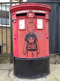
We love the cool way Miilo has transformed the Post office logo into a teeshirt design here
Mean strikes a blow for Shoreditch graffing
Mean
Binho brought a delicious characteristic Brazilian style to the streets of Shoreditch
Binho
Saki was pretty busy this month in particular doing some wonderful stuff in the windows and doors of a barred abandoned building but this isn't it.
Saki and Bitches
SP Zero76
It has been quite a while since a street artist provoked such unanimous hostility as 2-Square, perhaps it is the work on the walls, perhaps it is the dippy hippy over the top sheepskin look, I'd like to think it was collective critical horror at their piss poor painting slap next to the Roa Hackney Road rat
2-Square
C3's work has charmed us mainly by dint of appearing in D7606's old phone boxes and vintage TVs so it was nice to find this large size heavy duty one off solo piece of work.
C3
Also making a more than welcome return to Shoreditch's walls was environmentalist Xylo. It has not yet been determined if this tile is referencing the work of sculptor Jacob Epstein or a droid.
Xylo
To finish this look back, this manic cracker on the home turf of HowAboutNo from the cans and brushes of Rowdy and Sweet Toof

Sweet Toof, Rowdy
Words NoLionsInEngland
We are just over halfway through October so it must be time to reminisce fondly on the street art that appeared on Shoreditch walls back in September. We can also reminisce on the good old days when the part of Graffoto wandering round with a camera would let the part of Graffoto that thumps the keyboard keys know that the pics were ready in the draft box;-)
MJar put up some wonderfully hand coloured and spray finished paste ups then he got round to fighting evil nasties by putting his paste up faces over advertising for a record which was trying to pass itself off as street art.
MJar
Art Is Trash is still around and still looking like the big new thing in street art for 2013. The non conformist anthropomorphised packaging of his installations continue to defy categorisation as domestic refuse (white bin bags) or restuarant waste (black bin bags) and so create a pavement mess for quite a few days! He also takes up cudgels on behalf of the virtuous by assaulting flyposters placed over graffiti, the particular modification below were truly spectacular.
Art Is Trash
Is was nice to see Pablo Delgado back at the bottom of the brick canvas, this particular example of his work being quite epic.
Pablo Delgado
Our favourite Brazilian Cranio rounded off his visit to London with this scorching Mural showing hs friends the rainforest indians enjoying their drugg, pets, iPhones and replica kits in a denuded brown landscape stripped of trees. Sadly the day after he left some toys went to town tagging it.
Cranio
Unknown unknown
We love the cool way Miilo has transformed the Post office logo into a teeshirt design here
Mean strikes a blow for Shoreditch graffing
Mean
Binho brought a delicious characteristic Brazilian style to the streets of Shoreditch
Binho
Saki was pretty busy this month in particular doing some wonderful stuff in the windows and doors of a barred abandoned building but this isn't it.
Saki and Bitches
SP Zero76
It has been quite a while since a street artist provoked such unanimous hostility as 2-Square, perhaps it is the work on the walls, perhaps it is the dippy hippy over the top sheepskin look, I'd like to think it was collective critical horror at their piss poor painting slap next to the Roa Hackney Road rat
2-Square
C3's work has charmed us mainly by dint of appearing in D7606's old phone boxes and vintage TVs so it was nice to find this large size heavy duty one off solo piece of work.
C3
Also making a more than welcome return to Shoreditch's walls was environmentalist Xylo. It has not yet been determined if this tile is referencing the work of sculptor Jacob Epstein or a droid.
Xylo
To finish this look back, this manic cracker on the home turf of HowAboutNo from the cans and brushes of Rowdy and Sweet Toof

Sweet Toof, Rowdy


