Saturday 18 October 2008

Burning Candy Show


Sartorial Gallery, London
15 Oct – 11th Nov 2008

photos NoLionsInEngland unless stated

Something of huge significance is afoot when you open your week-to-view pocket diary (luddite alert) on Monday lunchtime and find that despite clashing with an England world cup qualifier there is there is barbed wire around a Wednesday evening do. That event is the Burning Candy show, christening Sartorial Gallery’s new premises in the apparently “growing art location” of Kings Cross (street evidence: one ancient Obey Mao paste up and a Tox 03 tag).

Having some art schooling allied to a hardcore collective spirit it is not surprising that Burning Candy – or Before Chrome, various pseudonyms are interchangeable – get some highly accomplished emulsion and spray pieces all over East London, not to mention Bristol and various other locations. The dilemma is not so much where to find evidence of the street pedigree as to sift and shake and generally reduce the selection of street piece down to a short list of photos.


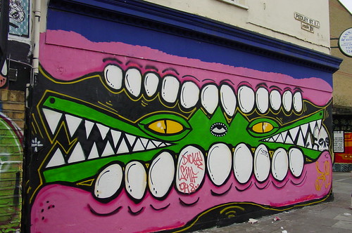
Burning Candy, Brick Lane, London. Photo: HowAboutNo


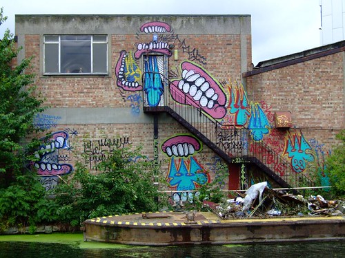
Burning Candy, Regents Canal, London. Photo: HowAboutNo


First question to be addressed is what and who is Burning Candy? A tight collective of street artists centred around Sweet Toof, Cyclops and Tek 33 but occasionally extending to Rowdy and recently also Gold Peg. In contrast, most of the works in the show are attributed to the individual members with just a few given as joint between Sweet Toof and Cyclops.


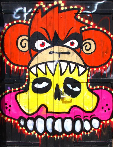
Burning Candy feat Rowdy


Burning Candy feat. Gold Peg


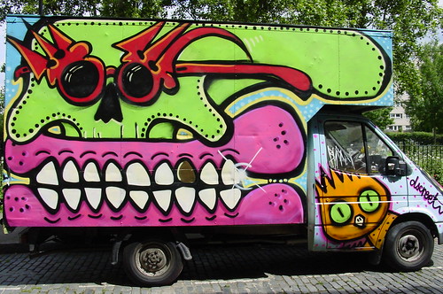
Burning Candy/Sickboy, photo: HowAboutNo


Burning Candy/Mighty Mo, photo: HowAboutNo


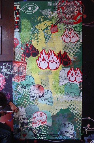
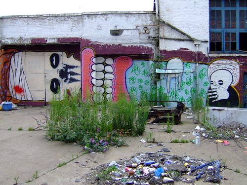
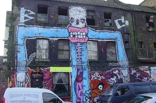
On the streets the most obvious characteristics of a Burning Candy piece are those gums and the skull, though attribution is not always as obvious as it seems as occasionally if one member’s signature element is required but that vandal is missing, his federate crims will happily fill in the piece in his style.


Burning Candy & DScreet


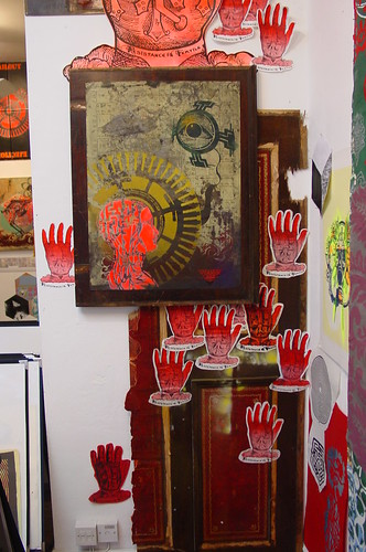
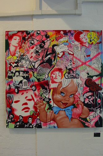
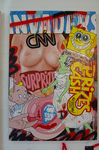
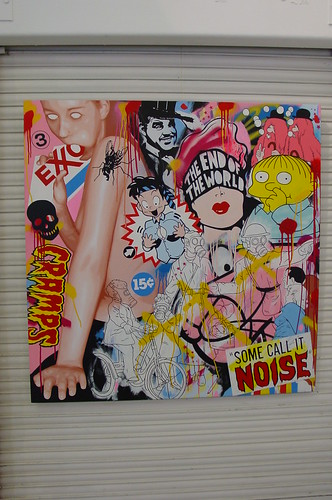
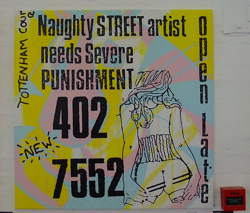
Turning attention indoors, the most striking piece upon entering the space is an installation of text and tags on a variety of bits of wood mainly sign boards, though car body panels and toy prams are also thrown into the melee. The installation has a higher typographic content than the typical street work.
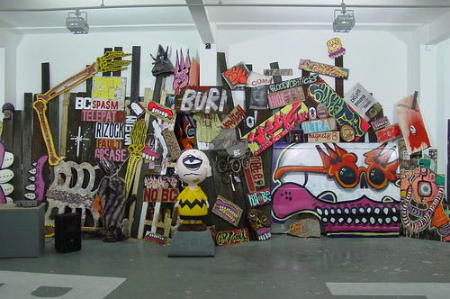

Craft Spasms


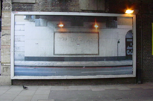
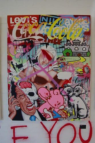
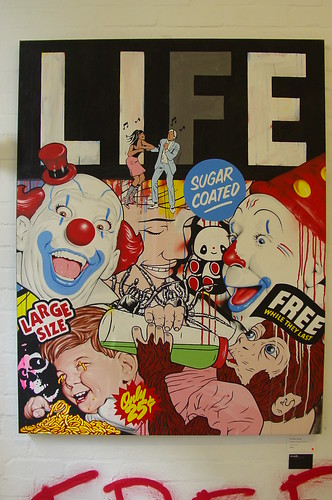
The show is delicately balanced between sculptural pieces and paintings, though the physical space is bisected by a floor painted cri de coeur which also repeats in small details in some of the installations, highly relevant giving the Stalinist buffing underway on London’s East End streets in recent months.


Fuck The Buff


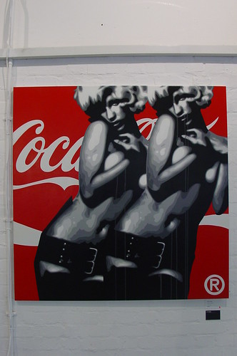
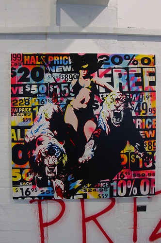
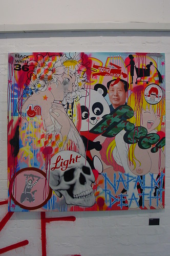
Although Burning Candy are a tight knit crew and gets up as a single entity, the hand of each individual member can usually be distinguished. Sweet Toof’s work is characterised by a cartoonish aesthetic, plenty of anatomical detail, an un-expected amount of detail such as in painted cloth fabrics and of course those gummy grins, without which the Sweet Toof work could be seen as referencing the Mexican dia de los meurtos.


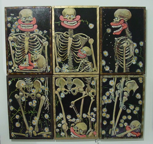
Daisy Daisy I, II and III – Sweet Toof


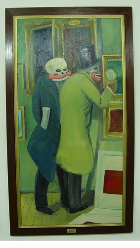
A quartet of large canvasses present himself and Cyclops as some pair of muttering old codgers who, thanks to the gums, obviously have a wicked sense of the bizarre, Cyclops and Sweet Toof ARE Statler and Waldorf.


Bloody Critics – Sweet Toof


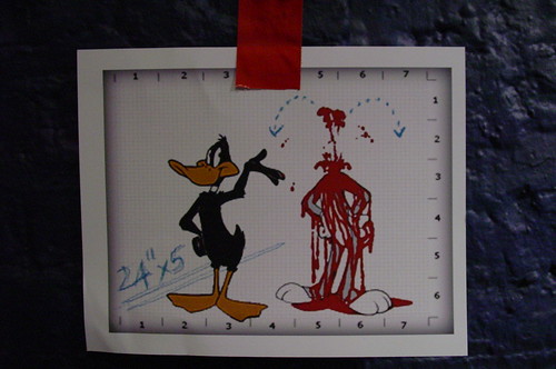
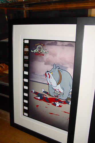
A repeating theme in Sweet Toof’s work whether on the streets or indoors is a pre-occupation with innards. On the streets the most notable example is this manacled skeleton on the site of the “This Is Not A Bar” squat, apologies for the obstructions in the photos but those intestines reach the floor then meander around the architecture – the character looks like he is plagued by serious gut rot.


Burning Candy, Sclater St, London


Gizzards are worked in amusing ways into many of the Sweet Toof paintings though the comedy muff on some of the scarier looking sculptures doesn’t bear close examination


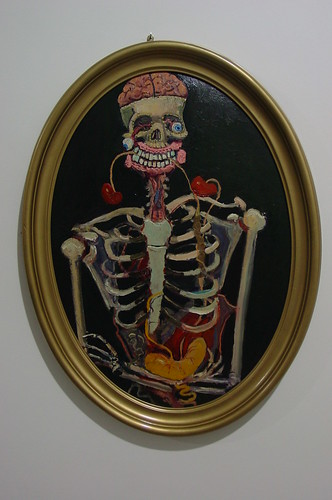
Bad Guts – Sweet Toof


A Burning Candy creation featuring frequently on the streets is Lenny The High Roller, his components parts are usually gums by Sweet Toof, skull head by Cyclops and sometimes hats or other decorations by street luminaries such as DScreet and Sickboy,


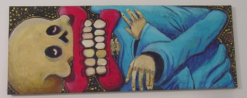
Love And Hate – Sweet Toof & Cyclops


Sweet Toof’s work seems to be the most prominent within the show though, as with the street work, it is possible that elements are contributed by the Burning Candy cohorts.

TEK 33 appears less frequently in the street works than Sweet Toof and Cyclops, mainly due to having better things to do in a Scandinavian sense. When he works on canvas he tags the piece using his real name, James Jessop, maybe Sweden has no extradition treaty with the Met. Tek 33’s three pronged motif is a familiar element in the Burning Candy street work though for this show, Jessop has taken Pink Panther from the film credits as his cartoon character of choice and worked the Pink Panther features into the three pronged tag


Jessop has baggsed three corners of the room for very large and acid bright canvasses, including this piece in reverence of late NY ‘80s legend Basquiat.
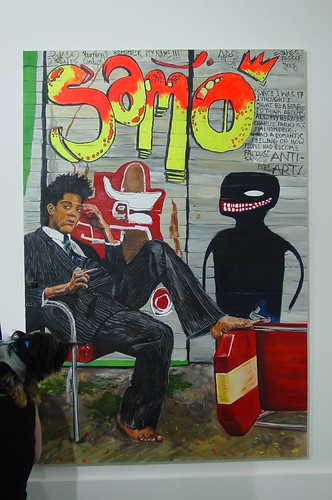

Samo – James Jessop
(nb The dog lost the staring contest)


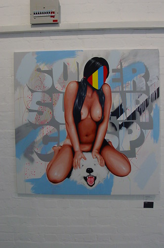
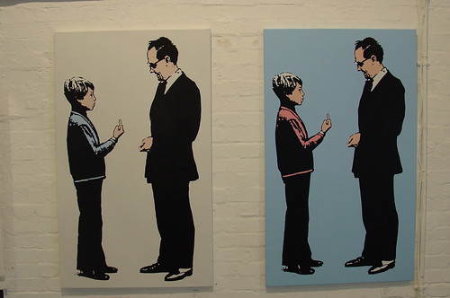
Cyclops’ canvasses have a finer indeed almost academic approach, being cluttered with streams of conscious wordplay, invented band names and references to half realised situations and un-finished slogans. The text makes fascinating reading, in the way of someone slowly tuning a radio hears snatches of music and conversations before moving on.


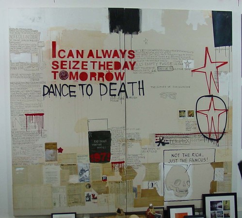
Sons Of Super Significance - Cyclops


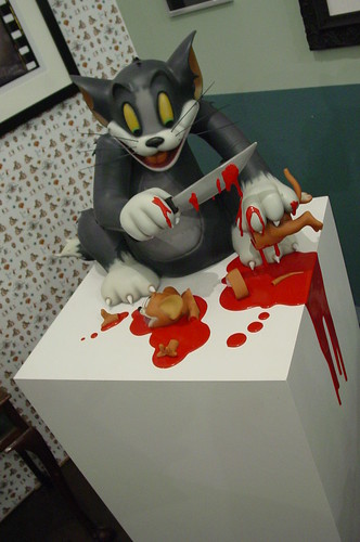
Cyclops’ typographic content doesn’t get in the way of ploughing an animator/cartoon illustrator furrow, particularly with the Peanuts characters Charlie Brown and friend Marcie who appear on canvas and in sculpture


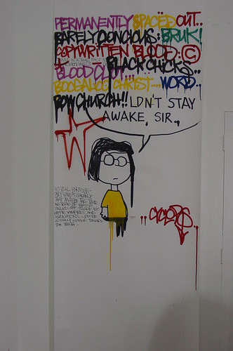
Black Chicks - Cyclops


Moving on to the sculptures, a pair of stick characters extend limbs across the floor and will trip up the un-wary. The bodies are built up from what look like found objects including ancient brass oil cans, wood boxes (and sticks) and then erratically coated with a white paste and garnished with all kinds of shiny beads and objets trouve. The obligatory gums and skeletal dark orbs form the eyes, heads and teeth.


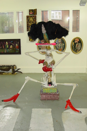
Vagina Denta – Sweet Toof


Hunter Gatherer – Sweet Toof


Burning Candy is mutated anomaly in being a graff crew with its origin and output more in a street art vibe rather than can control Puritanism of graffiti writing. This show accomplishes that rare feat in the street/gallery cross over of reaching an appropriate gallery standard quality of work yet successfully capturing the high colour and energy of their street work.


Burning Candy caramelised

Visit the dentist – pics of lots more gums, skulls and lady’s bits from the show here

Saturday 11 October 2008

SPLATTER – J Cauty & Son


the plausible impossibility of death in the minds of cartoon characters - part 4.

Aquarium L-13, 63 Farringon Road.
9 Oct - 8 Nov 08


Cauty’s Splatter show got awesome pre show column inches in the press. Controversy, epic copyright infringement and a PR agent will kind of see to that. 90% of every piece in the papers has focussed on that awesome cv, the baggage of musical mis-ploits and interventionist nihilism that Cauty carries round with him. Just to be different, let’s first start with some recent street credentials then actually see what was at the show.

Conceptual street art piece of the year to date is (totally objectively and definitively - hah) the trA toN sI sihT billboard below. People not aware of this site should know that the image on the billboard is a “reflection” of the other side of the road. The photographer and the poor ol’ pigeon aren’t reflected in the “mirror” which was a head bender on many kind of levels. Cauty confessed to having considered putting a photographer in the picture. But that would have been silly!


trA toN sI sihT


image compression dissolves the detail in the reflection, you can see it more clearly here

The idea for Splatter was Cauty Jr’s, the idea that cartoons lacked the element of conclusion, the natural effect of the level violence sustained by cartoon characters would result in the real world in plenty of spilt claret and shredded limbs. So, bring on the gore and mirth.


Hooding (Mothers Against Violence: Sick)


The show is an almost partly organised multi media melee with sculpture, prints, video installations, lightboxes and mini artefacts. The front window is taken up with an glossily executed Daffy murder scene in resin. Be on notice from that point onwards to expect violence, amputation and blood.


Operation Vigilant Justice


Further sculptures range from the pedestal based Aim Point down to more manageable but dis-proportionately expensive TV top statuettes. Splatter images have been peppered over a range of products including limited edition mugs, mouse mats (cooooooool), wallpaper and badges.


Aim Point


The key piece of the show from which it seems all other images are lifted is the animation. Showing the DVD at home to the Nolions pack had the 8 year old rolling with laughter, favourite bit “the blood fountains” and the 11 year old declaiming it as weird and lacking plot structure. And demands from Lady NoLions for the volume down.

The DVD is a 7 minute looping compendium of carnage and high pressure blood geysers. Without doubt the enhancement of the animation is utter convincing, the credits at the end of the DVD identify the animator bought in to help with the realisation.


Tom and Jerry – retains visceral humour


There are essentially seven core images lifted from the animation that form the basis of all the prints, sculptures and artefacts in the show.


Operation Vigilant Justice (counter attack)


Many of the images do not bear the blowing up to poster size and giclee print process, the vague fuzziness where animation ought to lend itself to crispness may suggest sticking to the mini-cells on repro film (is that geekin-ese for acetate?) or smaller prints would be a good idea.


Operation All American Tiger


Does the show do what it says on the tin? Absolutely, buckets of blood and severed limbs everywhere.


Basic Stopping Power


Is it pioneering? Perhaps, perhaps not. Many will recall a level of savagery in cartoons from 30-40 years ago which was way more graphic than what passes the diffident and sensitive programmer’s editing suite these days. Also, Itchy and Scratchy sort of provides a similar level of dismemberment, though without the graphic fluid leaking all over the screen and that is really the question begged by Cauty Jr who came up with the concept a few months ago (so that’d be the school holidays then), what happened to the blood and why didn’t they die?


Dispersion Error (“Daddy, what’s a dispersion error?” - honest)


Is it fun – hell yeah, the inner comedy anarchist is highly envious of making those animations and pictures for a living. Its also the most shambolic chaos ever passed off as an art opening, viewing the DVD installations required mountaineering over jumbles of boxes and rubbish which actually possibly might have been the shop stock! We expect nothing less from Cauty.


Careful now, don’t hurt yourself


Anyone with the slightest awareness of the protective attitude of large corporate brands will be pondering the chutzpah of such brazen image theft. In keeping with the theme, Cauty himself bears his chest to the legal snipers and his video disclaimer almost taunts WB to bring it on.

Splatter disclaimer


The static images had a flaw in that they are freeze frames from a medium that relies on frenzied action and “that’s all folks” furious music. The pictures really need the benefit of at least a cartoon strip to provide the full joke, otherwise they are just “ha ha – blood” stills without any particular joke. That said, Cauty Jr has pulled off a bright idea edges with controversy and accomplished a fresh show with his old man’s ability to deliver undoubtedly significant in getting there, for his sake lets hope he appreciates it isn’t always so easy. Are my kids going to turn into pistol toting murderers? Hopefully not but why is my wife polishing that axe?

Splattered all over the stage - more photos here

Hands up if you are amused by the dig at art pretentiousness in the meaningless addition of “part 4” to the sub-title [both hands raised]


PS If your kids need to know what dispersion error is, well this is it:


The distance from the point of impact to the mean point of impact

Friday 3 October 2008

Peripheral Media Projects – Pure Evil Gallery


Among many other cities, towns and urban space perimeters around the world, London has been graced by PMP output already this year. The most visible appeared around the time that the late lamented Leonard Street Gallery was showing Bast and Judith Supine.


PMP – Shoreditch Jan 2008

In the context of the current ultra-buff underway in East London, many street paste-up artists could take a leaf out of the PMP street survival guide and get up high. More than one of their pieces have survived for the best part of a year right at the epicentre of the council graffiti fatwah.


PMP – Shoreditch Jan 2008

PMP’s street work in London has embraced a kooky spectrum from situationist Guy Debord (French situationist and poet) to the slightly baffling cufflinked wrists with origami pieces of paper cranes, not to mention a stencilled skull which still survive despite being comfortably within reach of the short arsed council buffers. In fact, at the start of the year it seemed you coudn’tturn a corner without having your brains poked by a PMP paste-up.


PMP Skull – and others
First thing to know about Peripheral Media Projects is that the name means something which is NOT mainstream media. Nothing about these guys really speaks of conventionality or conformity. And projects? They have a track record in activism, organising illegal parties and un-authorised mass assemblies in NY. Third, these guys have a big thing on the New York street art scene which is Ad Hoc gallery. How big? They have had shows this year by two fave rave artists Elbow-Toe and Armsrock.

The show occupies the upper front room of the Pure Evil gallery. Most striking and obvious are the large hanging wraps which are mega collages of PMP output.


PMP Police Collage


The detail within the collages is almost entirely the result of the political pre-occupations of PMP and it’s worth recapping their origins and motivations. PMP are two guys (at least – at this show) who have campaigned on a variety of right-on street manifestos since about 2000. The origin was not so much a protest as a raising of awareness, executed through a simple text based recitation of facts which you ought to be aware of. This then developed into a more artistic image based campaign. The agenda wasn’t really anarchistic revolution, just heightening concern. Now, their unique and incredibly detailed graphic artwork targets global issues including inequality, globalisation, media consolidation, authoritarianism and environmentalism.

PMP - Plastic Ocean
Their commitment to environmentalism shows in the willingness of PMP to scour the streets for reclaimable materials for backgrounding (new verb!! It’s what happens if you talk to Americans for more than 10 minutes) their work. Even the majority of the frames are recycled from a skip outside a Leonard Street architects' practise, as well as quite a chunk of that white plastic cardboard stuff.

Most recently their message has moved on to the next stage of sowing the seeds, the idea that with enough conviction, ideas can be spread and power might be generated through numbers.

PMP - Resistance is Fertile


PMP have been particularly energised by the post 9/11 infringement of civil liberties as the authority took advantage of heightened paranoia to justify radical interventionist policing policies, notably the crack down on un-authorised popular gatherings for fun. Any slightly left field gatherings such as the highly subversive Critical Mass (flash mob pedal powered bicycle knitters) particularly coming in for draconian targeting and control.

One particular motif repeating in the work is the Panopticon, in its purest form this refers to the hub and spoke – bicycles again – prison architecture which allows the fewest people to supervise the maximum number of crims. Although this echoes at many scales in different pieces it is probably most graphic is this reclaimed studded panel.

PMP – Optical Panopticon

This Panopticon even features in what could easily be mistaken for snowflake backgrounds.

PMP


The All Seeing Eye crops up repeatedly in PMPs collages, usually in the guise of a sinister big brotherish tool for spying and control. The eye as a symbol of evil invasive tracking is superimposed on a thumbprint, embracing the very essence of individuality, everyone being unique, yet simultaneously the thumbprint is the most common way of tracking and identifying specific human beings. The eye, all seeing and watching over you is also a component of the grand seal of the United States. Hah! – think about that then conspiracy theorists.

PMP – All Seeing Eye


PMP fuel dissatisfaction with the status quo through repetition and illustration of facts which frankly should alarm all individuals with a view towards preserving individual liberties in the face of mass indoctrination and prescriptive manipulation.

PMP – The Beginning Of An End Of An Era Of Consumption


Moire patterns, or as they are more commonly regarded – interference patterns (think regional soccer pundits in loud suits) are used as the basic construct in many of the big brother eye images.
PMP – Tune Out


Two specific elements in this show are identified as new PMP images, Rejection Ejection Dejection Bailout is a further Panopticon image

PMP - Rejection Ejection Dejection Bailout

And the second new piece is the distinctively feminine skull counterpoint to what had always seemed to be a quite non-specific gender-free skull.

PMP – Detail

The temptation to recycle and repeat last done imagery is probably quite tempting for many artists passing through London but in addition to gloriously re-decorating our streets PMP have overlayed their stencilled skull on an iconic London view over one of our most long standing and classic cultural panoramas – Canary Wharf and Isle of Dogs.
PMP – Hope For London

One aspect of the presentation which left a sense of under achievement was that images as busy as the PMP wall collages really didn’t need a fight with the abstract swirls on black remaining from the previous show – those walls could really have done with a black wash prior to hanging.

PMP on top – Psychedelic Brazilians behind

With PMPs work you shouldn’t really expect an epic grandeur best observed from the other side of the street, you put your chin on the bottom of the frame and lets your eyes hoover from side to side. Close scrutiny reveals the intricate details and reveals the plethora of ideas and ideologies.


Quite a few more photos of the show here

Tuesday 30 September 2008

Ben Frost - Crapitalism

No Walls Gallery
Old Truman Brewery
Ever had the feeling when you walk into a show that you know you should sneer, that you ought to dislike the art, you know its derivative and lacking in actual art but heck, it still looks damn good?

Ben Frost last week (sorry – been too many other things to do) revealed a wild collection of lurid colours, sleazy but alluring imagery and anti capitalist cynicism. Of course, that was the easy bit; you serve up naked women (on canvas, not real, that would be pole dancing you see) to a predominantly male audience and lubricate with copious beer and heck, how could you possibly faile?

Art Sucks Fool

Frost is borrowing the tools of street art and creating his own caustic form of urban art. The urban collage effect composition is there, the conventional targets are present and correct and of course there are the obligatory dribbles, so we can register this as urban art.

Babyshambles

For most of the un-editioned pieces Frost uses a technique which might be described as cluttered pop art collage. There is a clue in the title which accurately reflects the subject matter. Corporate branding and advertising comes into the cross-hairs served with a tangential snipe at rah rah rah Americana.

See Inside Box For Details

Capitalism depends on consumerism, or has it created consumerism? It has certainly spawned a culture in which we must be told what to consume and ad execs have two ways to our wallets, bribing us with the ideal of the happy nuclear family and using women as sex objects.


Sorry When You Said Hold The Irony I Thought You Said Fold The Ironing Board


It seems that, not unreasonably, Frost is anti female exploitation as a device to sell us solutions to problems we never knew we had.

Girls On Coke


Frost however has a slightly ambiguous approach to the role of sexualised women to communicate a message, witness the logo being fellated in this picture which begs to be read as a dig at Big Oil’s arrogant presumption that we must all suck its dick.

Some Call It Noise


It is hard to tell if the objectification of women for self gratifying purposes is something Frost feels is positive or negative about but there some images whose link to porn is a lot more obvious than its anti sex for selling message. This write up is doomed to disappoint anyone who is hoping to see the large canvas of the anal and vaginal self fisting, anyone so inclined will probably know to look elsewhere for that kind of imagery.

Super Sugar Crisp


Another Frost motif is the cut away skull, giving us a direct insight to the brain being manipulated by and polluted through the crass commercial bombardment propagated by advertising and the media.


Apocalypse The Musical

Tigers crop up in several pieces, possibly symbolising the rapacious fat cats and shareholders using the media to manipulate the buying habits of a suggestable populace. Then again, it might not.

Lions At The Door

Stand up against corporate shit is a simple but courageous act most tellingly portrayed by the young man flipping the finger to Mr Suit. Being unable to shake the thought that the man looks like Sweet Toof on a bad hair day makes it hard to take the suit seriously (try not to be swayed by that thought. If it takes hold, you’ll never be able to give this picture the credit it deserves).

Thanks White /Thanks Blue


Frost gives one more nod to the street art movement though this time thankfully there is little reason to be reminded of any British street artists you might see around from time to time. (If there is, do tell)

Naughty Street Artist


Frost could surely find a friend in Jamie Oliver whose campaign to improve the shit we feed our children is well known, thanks to the worms wriggling out of the eyes of a boy gobbling up what looks like tinned spaghetti, well known for its obscene subliminal sugar content, didn’t your mum warn you if you ate too much sugary stuff you’d get worms?

Free While They Last


The ultimate destruction of American capitalism thanks to its habit over the last decade of exporting its blue collar jobs across the Pacific to China is symbolised by Chairman Mao’s Anatomy Of A Burger, obviously there is no more potent symbol of America than the instantly satisfying but short lived appeasement of the American burger, Frost choses to chide America for the suicidal convenience by showing China represented by a panda giving a serious rogering to an all American silicon inflated blue eyed blonde cartoon girl, to her evident ecstatic and oblivious delight.


Chairman Mao’s Anatomy Of A Burger


Small editioned items look really nice on wood with quite substantial elements of hand variation. If only the images were a bit more wife-and-child friendly they’d certainly be a reasonable addition to any budget art collection, such as Naughty Street Artist shown above available as a smaller piece in a varied edition of 25 or this:


All Your Friends Are Dead


In a novel and cool gesture, anyone buying one of the editioned pieces had the piece signed and dedicated to them there and then on the spot. Surely Banksy, Walker, D*Face et al could pop around everyone’s house when the PoW tube pops through the door?

This body of work, by “controversial” (gallery’s words) artist Ben Frost prises the scales off the consumer’s eyes to reveal the rotten and degrading tricks used by big corporation to persuade average Joe to part with hard earned cash in pursuit of a fabricate dcommoditised Nirvana. Frost picks at the seedy side beneath child friendly benign capitalism through possibly the wildest excess of colour and noise since those arch exploiters of the corporate music industry Zigue Zigue Sputnik.
Vampire USA (try not to be reminded of Pam Glew)
As per, quite a few more photos of the show here