Eine Goes L......Errrm, Small. Then GLOBAL
HowAboutNo & Nolionsinengland interview Ben Eine and take snaps, except knocked-off flicks where stated.
Some may have thought that Eine's fairly recent departure from the big smoke to the sleepier climes of East Sussex would have meant a quieter existence for the man with probably the most raw pigment in public places in the UK. Graffoto thought it was going to cover the story of EINE’s re-appearence on East End shutters with a new lower case project, little did we or even Eine know of the sudden and dramatic high profile role Eine was to take in the UK-US “special relationship”, more of that later.

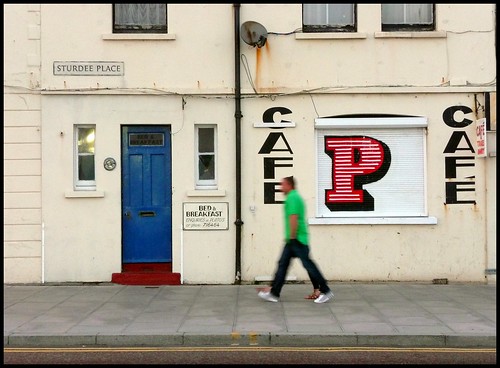
Less damage to Shoreditch walls and shutters may have seemed true for a while but to compensate, a short hop skip and a jump down to the the South East coast provides ample evidence that Eine has gone about introducing himself to the residents of Hastings and St Leonard's in his usual brash and colourful way.
He began painting Hastings shutters at the end of October 2009 hitting a variety of seafront, backstreet and high street properties with his classic Eine shutter font capital letters.

More evidence of Eine's campaign in Hastings from HowAboutno
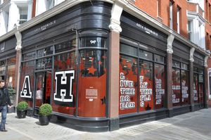
hereSince the spring there have been signs of a resurgence in Eine's London focussed decorative output. Other than court appearances there aren’t too many times that a rough diamond art vandal might make a mark in the poshest parts of London but in achingly expensive Knightsbridge, where usually the only spray is a very expensive parfum, Eine turns his hand to designer fashion accessories, coming up with a range of canvas shoulder bags (says our fashion correspondent) for the Anya Hindmarch boutique with a fancy West End price to match.
 Eine – Anna Hindmarch bag, no other accessory necessary.
Scattering some Eine letters across the shop front gives the venture the cachet of a connection to street art cool, as Eine is supping with the commercial devil here perhaps it’s appropriate the shop interior ends up looking like a pussy pampering corner in Hell’s chill-out zone.
 Not HELL. (click here for HELL!)
 Anya Hindmarch boutique, Sloane St, London
World cup fever spawned the Umbro teeshirt design but the emotion an Englishman is least likely to connect with that event is ecstasy, so Eine tempted fate by incorporating an acid smiley. Not to be down on the idea though, the appeal was immediately obvious upon seeing Abby Clancy modelling the tee.
 Umbro England World Cup Tee detail - nicked from Umbro Blog. Abby not included
Eine provided some signature shutters to the RED cafe which opened earlier this year in the building which until very recently housed legendary core arts grunge gallery-bar The Foundry (RIP). The nice touch in this piece was Eine integrated into his D a conceptual piece which Part2ism has been putting up around town as part of his CMYK project.
 EINE shutters. Floral skeleton and embedded CMYK project by Part2ism
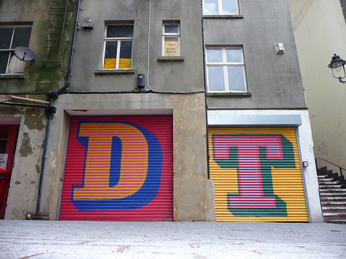
Eine’s shutter font is up there with among the world’s most iconic street art motifs - Andre The Giant and a rat. His seemingly sporadic, separated and isolated shutter letters have appeared across East London over many years. It isn't right to describe them as meaningless un-connected individual letters, Eine invites the observer to make whatever connections they like between letters.
An Eine letter shutter tends not to get tagged to blazes and they brighten the urban causeway of sleeping shop fronts. Rather than receiving a hostile reception, many shop owners hanker after an Eine letter. A place on Ravey Street not only has had an Eine R on its shutter for a couple of years but the occupiers have actually reproduced the letter inside its glass front so that even if the shutter goes up, Eine is still up!
 R for Ravey St? (look closely - not a shutter)
In all the years these letters have been appearing on London’s shutters they have been sturdy upper case characters, capitals for the capital. Now in belated recognition of the un-sung heroics performed by those little letters after the capitals, a 100 yard street stretch of Middlesex St in London’s Petticoat Lane area has been taken over by EINE to introduce a whole lower case alphabet - and a little bit more.
 Alphabet St - princely
Graffoto’s keyboard botherers have been among the many who have obsessed over many years with photographing individual shutters to complete the set, so the purpose of painting the whole alphabet in one shot is intriguing and Eine’s explanation reveals the un-suspected complexities and ego issues behind getting up his lettering.
“Basically I had the opportunity to do the entire alphabet, We got permission off twenty –odd shop owners to paint the a-z. Normally when I ask permission the guy that owns the shop wants us to do an R and an H because his shop is Ruby Handbags or an S because his girlfriend is Sally.“
 Whole Street Top To Bottom letters
The lower case alphabet project started about a year ago but even up to the moment the first can was pointed at a shutter the outcome was still uncertain.
“Eventually we had sixteen or seventeen owners that said yes they would let us do it but they hadn’t agreed to letting us do the letters we wanted and we thought “let’s try it, let’s start and hopefully as we paint them the other shop owners won’t want to get left out and will fall in line.“
Eine’s alphabet is in a sense circular in a very physical way as letters a to m go with the traffic down the street, o to r face them in order against the flow on the other side then s to z are back up at the start on the other side of the street with the y and z looping around to butt up against the a.
“We’ve managed to do it and there’s only one gap in the shutters, there was one shop owner who was definitely not having it” says Eine.
Eines has painted each letter of the alphabet in upper case more than once, in a variety of different colour ways.
“I write things with photographs, so I create my own font and a nerd kind of typography thing is that when a word has got say two “E”s in it rather than using the same E you could use two different “E”s.
 BIG ISSUE 2008 Street Art Special feat Eine Graphic Typography
“Half the fun of them being out there is that people can photograph and use them, I’m happy for that” (he adds with much more relish than the typed words might convey).
The work took 5 trips to London which requires a little bit of thinking ahead about colours.
“I bought maybe 200 cans and I laid them out in colour order and I put enough paint in a carrier bag for three shutters. Two colours that would go together for one shutter, two that are opposites and two colours that don’t work together. Then I pick the outline and the horizontals. “
But the all important colour selection isn’t necessarily finalised until Eine is actually on location.
“Quite often, as I put a colour on the shutter I think “ah, that one will look better” so it kind of changes as I paint it”, a dynamic colouring process Eine describes as based upon “motion”.
“When I first started painting I wasn’t being random, I was bring quite selective in my colours and without noticing what I was doing I repeated the same colour combination quite a lot. So what I try to do now is be as random as I can with them to create new and different and more interesting colour combinations. I’m pretty confident that within my colour palette everything will work.“
One curio Graffoto noticed was a duplication of the letters q and r, their doubling up goes back to Eine using photos of the shutters for letterist graphic design.
“I draw out the letters before I go out and paint them but depending upon the size and shape of the shutter the letters change shape and size and the q and r had to stretch to fit the shape of the shutters otherwise it would have been all background and not much letter.”
The stretched q and r are placed on these longer shutters to preserve the continuity and rhythm of the alphabet along the street but Eine was able to write more conventional shaped q and r on a couple of nearby shutters and he’ll use those two when he puts together photographs of all the letter on a single sheet alphabet.
 q r squared
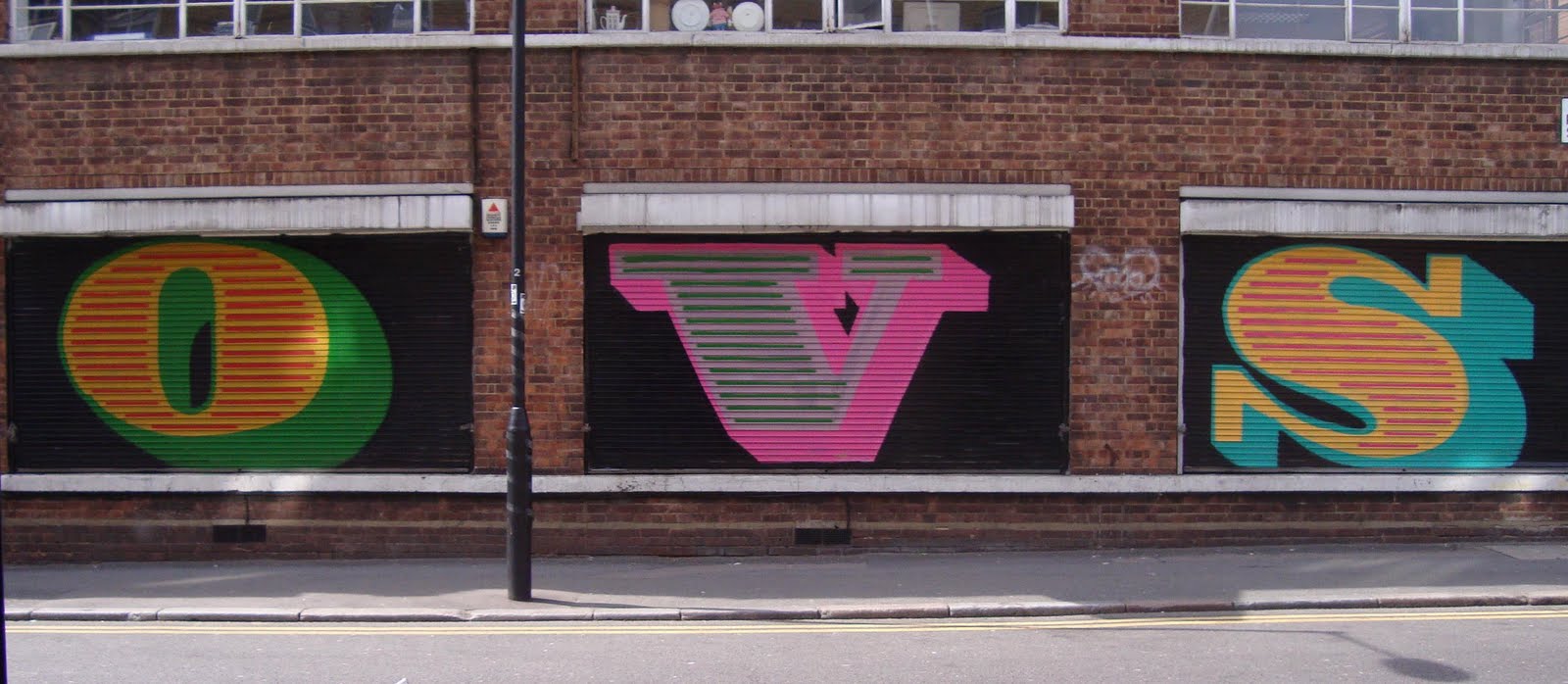
The randomness of Eine’s selection of capital letters is partly due to Eine’s need for different colour combinations for his graphic design projects, which sort of explains the appearance of curious non-words from time to time.
 Random Letters On Various Shutters
If you wander about 100 yards down Middlesex St towards Aldwych you will come across a very satisfying Eine shutter collection which appeared at the same time.
"One of the days I turned up to paint I didn’t realise but it was late opening, I was sitting there bored and I thought “I’m not waiting around any longer” so I grabbed some paint and said “come one, let’s go and paint this” and I had two guys with me who had helped me before and they said “but we don’t have permission to do this” and I said “yes, but don’t worry, it’ll be fine, no one is going to say anything”.
This illegal improvisation actually meet with strong approval.
“We were standing there at 5 O’clock in the afternoon painting them and all the suits were finishing work and going to Liverpool St and five or six people that you wouldn’t think would appreciate street art or graffiti stopped us and they were like “awwww really good job, you’ve really brightened up my way home which is great”.
 Illegal - happy now?
Months and months of hard work and Eine is basically playing to a few pedestrians and some rich old ladies. Then, illustrating how fate can mash up input and impact in totally disproportionate ways, a single canvas has conspired to bring global attention and turn Eine’s world on its head in the last couple of days.
“I got this phone call on Friday night, I was in my studio cutting some stencils, it wasn’t a number I recognised and i was “Shall I answer it, shall I not, shall I answer it, shall I not” and I picked it up and it was Anya Hindmarch”.
She of the shop/bag design combo earlier and evidently a friend of Samantha Cameron, accessory designer and wife of British PM David Cameron.
“it’s a weird phone call” she said “a bit secret, a bit strange but Samantha and David Cameron are really big fans of your work [did she really say it like that??]. David is looking for a piece of art to give to..and I can’t mention any names but...he’s the most important man in the World from America”.
Eine agreed, Anya asked to give his number to Downing St which must have seemed a slightly bait request, and Downing Street rang.
“Again they couldn’t say who the painting was actually going to go to, but again they made it pretty obvious it was going to be Obama.”
Downing St had checked Eine’s ancient and woefully neglected
website but all that stuff was long gone. Graffoto would have had no problem selecting a decent keepsake for the US President.

“I sent them some pictures of stuff that was available and they kind of hummed and haaa’d, I can’t imagine how many people had to agree it and disagree it and find out if there was anything vaguely negative or could be construed as bad and then eventually they came back and said “we really like Twenty First Century City”. They picked it up on Monday and it flew over to Washington with Cameron and was givn to Obama on Tuesday. They needed it on Monday and I got the call on Friday before.”
So Samantha and David panic buy pressies just like us real people!
 TWENTYFIRSTCENTURYCITY
 (photo nicked from Eine’s
website)
Political gifts must be subject to intense scrutiny for potential to offend and embarrass, so where did the inspiration come from? Eine told us “I had recently done a painting that said Metropolis and I was looking at the graphics of Blade Runner and I’d recently watched Blade Runner and “Twenty first century city” just kind of seemed to invoke the powerful imagery of Blade Runner”.
The reaction to Samantha and Dave’s gift and the sudden prominence in re-establishing the fractured entente cordial (didn’t their last President think that was a French soda?) has been astonishing and it’s ironic considering Eine’s ambivalence towards politics.
“I’m not massively political in any way, I doubt I would have voted Tory if I had voted, I didn’t vote as I didn’t have time, I was too busy with the kids but I also doubt if I would have voted Labour. If the painting had been staying at Downing Street it would have been a difficult decision to make but the painting was going to Obama so it made it a lot easier for me to say yes. I think Obama is a good home for the painting to go to.”
The international spotlight has picked out Eine (“Graffiti sensation” – Hello magazine; yeah that’s where Graffoto does its research) and quite a few media outlets who know diddley squat about his cultural significance have been bothering him but Graffoto gets in the critical question they all ought to be asking – will you be painting that famous door at number 10?
“I doubt I will be going to Downing St. The last two days have been pretty mad, lots of press and lots of TV, I’m hoping that it’s all going to die out and I can get back to normal.”
POSTSCRIPT (Sunday 25th June)
True to Eine's last comment above and his current burst of activity on the streets, Eine has been out in the company of Pure Evil and RYCA painting his heartfelt view of the events of the past 9 days:
 "The Strangest Week" - photo Pure Evil