27th NOV - 7th DEC 2008
22 Wellington Street, London,

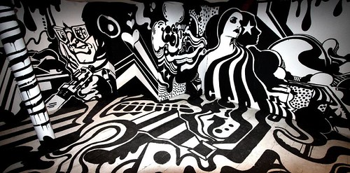
A Herakut figure can be incredibly elfin, pert and slender, or with heavy thighs, broad hips and generous midriff. The details may be drawn as if they are ugly, but God isn’t the only one who loves them. Curious to note some seriously over-size feet in a couple of the pictures.

Many of the canvasses continue last years theme of blending human and animal characteristics, through flipping the dynamic Herakut refer to the pet lover’s habit of bestowing human characteristics upon their animals behaviour, Hera and Akut are both keen pet lovers. The pug has been seen in many Herakut pieces over the last 12 months but there is only one in this show and that followed a suggestion from the buyer who commissioned the piece.
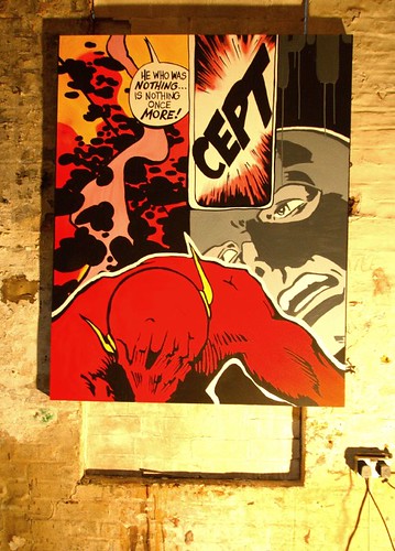
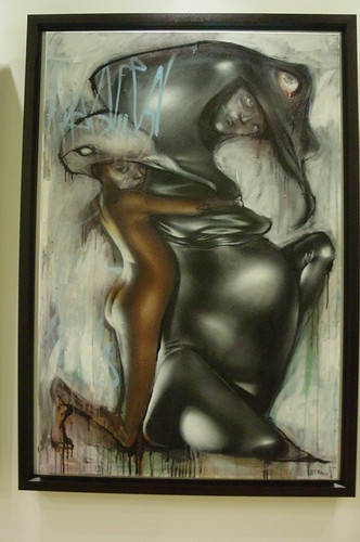
Rapacious wolves, rat faces and bunny masks are common through the many of the pieces, and it is a signature characteristic of Herakut that there is an element of melancholy in the sad eyed juvenile faces protruding under the masks. A sexual metaphor is evident in many of the Herakut paintings, none more so than in those pieces featuring a wolf about to dine upon a poor hapless naked victim. Hera highlights the malevolent influence of sex as a root cause of abuse.

Figures tend to be done with either a rich honey-skinned tone or a deathly, pastey pale, reflecting the hand applied the paint. Most eyecatching are the gorgeous renditions of soft and smooth flesh, usually culminating in a pair of young, firm breasts. That’ll do fine thank you.

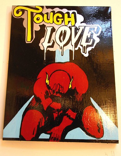
For You I’ll Do The Wierdest Shit
Hera and Akut combine photorealism and monochrome figurative elements in a bewitching medley of images. Their unlikely merger of styles now increasingly blend seamlessly, a testimony they say to the growing way they trust each other to develop a piece. Sisters, shown below, has one eye done by Akut and one eye by Hera.

It is perhaps more of a surprise to find that many of the sketches translate so faithfully onto the larger canvasses, where in contrast to the featherlight pencil lines Hera’s painting style becomes bold, loose and extravagant in execution. Compare this sketch with “She Thought She Was Too Cute” above, it seems the demeanour of the girl has changed dramatically from a challenging and defiant “do you worst” to a meek and submissive surrender to what we suppose to be her fate.

She Thought She Was Too Cute
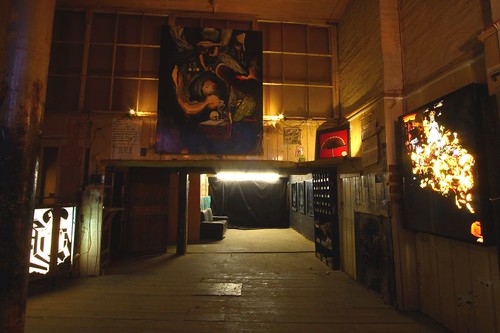
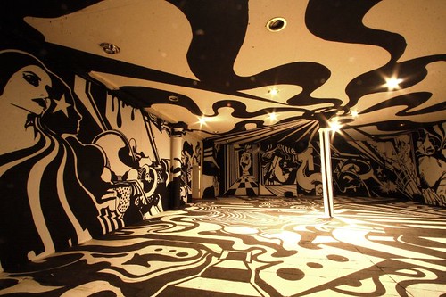
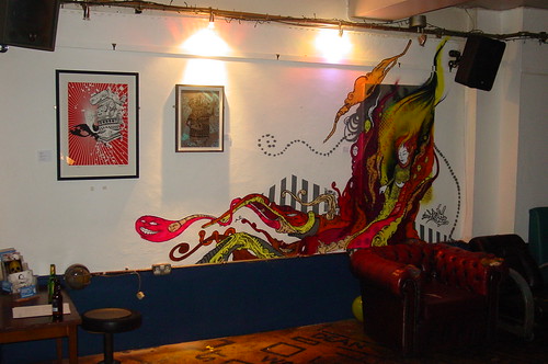
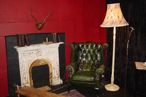
The downstairs installation element of the show is deliberately under-staged with no great drama or over-bearing artiness. The ambience is something of a “below stairs” servants quarters with a very cosy, clubby relaxation space and an old fashioned almost Dickensian clay tiled “no mod cons” laundry room. The washed drips look like collateral damage from laundry battles past, and form a gorgeous extension of the drips in the paintings.

Hood Rats
While “Mom” does her laundry (it is hard to reconcile the Americanism with such an English set-up), Dad seeks respite from the clinical whiteness of the upstairs area to sink into a deep leather chair next to the fire in a homely though slightly distressed chill out zone.

All the work at this show is effectively pre-sold, and is displayed as a collection, each picture being en route to its final lucky owner. With no direct return on the expense of staging this show, Campbarbossa deserves big props for putting on this show.
Whether your preference is for the richness, drips and intrigue of the canvasses or the sparse cleanliness of the sketches it is a pure joy to be able to see the set of works collected together and showcasing one of the strongest talents emerging from the street art scene today. However, if anyone at the show whispers in your ear “that one is mine”, don’t spare their feelings, apply your cricket bat to maximum effect.

Nine Eleven
A full set of pictures can be seen here though as usual, the low light in some areas challenges the camera (nothing to do with the photographer of course).
In the build up to this show Herakut were generous in their granting time for some conversation, hopefully sometime soon, who knows when - who knows where, there will be a chance to report the fruits of those interviews, you will be the first to know.
22 Wellington Street, London,
As the year draws to a close (how do artists tell when its holidays?), German boy and girl duo Herakut have staged a show of new commissioned art works through Campbarbossa, gallery with no fixed abode. The show is a sumptuous ensemble of the recent fruits of their labour and as nothing is for sale, it’s a pressure-free tribute and worship-fest.
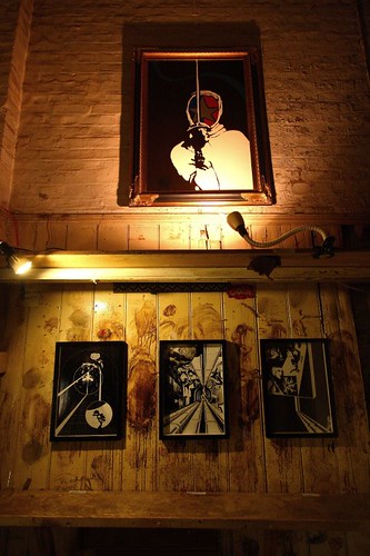
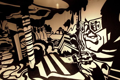
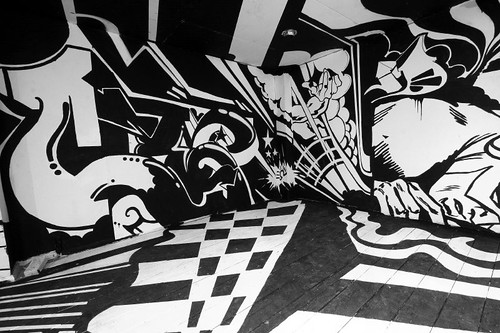
The setting consists of a small white walled space at street level, walls maxed out with the familiar flesh tones of characteristic Herakut canvasses, while the basement becomes a sort of Dickensian upstairs-downstairs kind of maid’s parlour taking the theme of the show’s title, which itself is a title of one of the canvasses. On show are paintings by Herakut, sketches by Hera and installation elements.
The setting consists of a small white walled space at street level, walls maxed out with the familiar flesh tones of characteristic Herakut canvasses, while the basement becomes a sort of Dickensian upstairs-downstairs kind of maid’s parlour taking the theme of the show’s title, which itself is a title of one of the canvasses. On show are paintings by Herakut, sketches by Hera and installation elements.

Herakut: Dirty Laundry. photo: Wallkandy
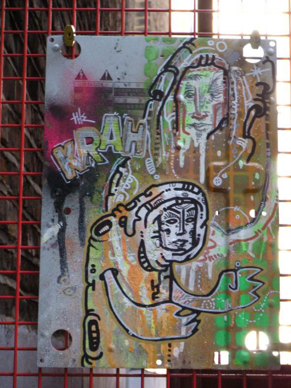
Herakut is the blended word identity of the two artists Hera and Akut, and the first lesson in the increasing difficult game of spotting the artist the Herakut template is to notice the photorealistic finish imparted by Akut to eyes, lips, and the more honey skinned flesh. Hera is behind the more dramatic and flowing figurative touches and the pasty monochromatic skin not to mention the surreal blending of humans and animals as well as the slightly bizarre written statements.
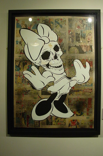
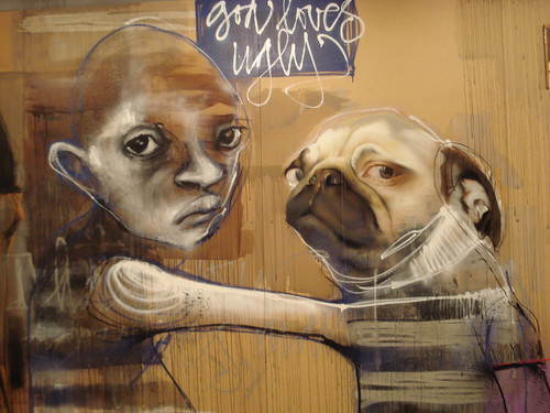
At last year’s well received London show “Permission To Paint”, a piece which continues to resonate was called God Loves Ugly, this confidence boosting statement reflects Hera’s ugly ducking syndrome and is key to understanding the sentiment behind a number of the works in the Dirty Laundry show.

God Loves Ugly
Herakut is the blended word identity of the two artists Hera and Akut, and the first lesson in the increasing difficult game of spotting the artist the Herakut template is to notice the photorealistic finish imparted by Akut to eyes, lips, and the more honey skinned flesh. Hera is behind the more dramatic and flowing figurative touches and the pasty monochromatic skin not to mention the surreal blending of humans and animals as well as the slightly bizarre written statements.
At last year’s well received London show “Permission To Paint”, a piece which continues to resonate was called God Loves Ugly, this confidence boosting statement reflects Hera’s ugly ducking syndrome and is key to understanding the sentiment behind a number of the works in the Dirty Laundry show.
God Loves Ugly
A Herakut figure can be incredibly elfin, pert and slender, or with heavy thighs, broad hips and generous midriff. The details may be drawn as if they are ugly, but God isn’t the only one who loves them. Curious to note some seriously over-size feet in a couple of the pictures.

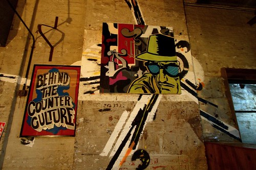
Zoning
Many of the canvasses continue last years theme of blending human and animal characteristics, through flipping the dynamic Herakut refer to the pet lover’s habit of bestowing human characteristics upon their animals behaviour, Hera and Akut are both keen pet lovers. The pug has been seen in many Herakut pieces over the last 12 months but there is only one in this show and that followed a suggestion from the buyer who commissioned the piece.
Rapacious wolves, rat faces and bunny masks are common through the many of the pieces, and it is a signature characteristic of Herakut that there is an element of melancholy in the sad eyed juvenile faces protruding under the masks. A sexual metaphor is evident in many of the Herakut paintings, none more so than in those pieces featuring a wolf about to dine upon a poor hapless naked victim. Hera highlights the malevolent influence of sex as a root cause of abuse.

She Thought She Was Too Cute
Figures tend to be done with either a rich honey-skinned tone or a deathly, pastey pale, reflecting the hand applied the paint. Most eyecatching are the gorgeous renditions of soft and smooth flesh, usually culminating in a pair of young, firm breasts. That’ll do fine thank you.

For You I’ll Do The Wierdest Shit
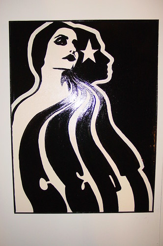
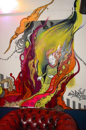
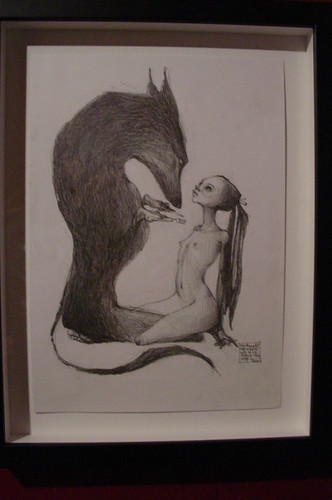
Hera and Akut combine photorealism and monochrome figurative elements in a bewitching medley of images. Their unlikely merger of styles now increasingly blend seamlessly, a testimony they say to the growing way they trust each other to develop a piece. Sisters, shown below, has one eye done by Akut and one eye by Hera.
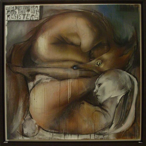
Without Their Arms They Were Sisters
One motif that repeats is several forms is a sad girl bearing a monkey on her back but this monkey has passed away (it is a dead monkey, it has ceased to be). As a linguistic gambit the “monkey on the back” usually refers to a burden to be shifted by making it someone else’s problem. Herakut’s title suggests that perhaps the concept relates to existence and mortality. As usual of course, this could be complete rubbish, it’s just a guess.

One motif that repeats is several forms is a sad girl bearing a monkey on her back but this monkey has passed away (it is a dead monkey, it has ceased to be). As a linguistic gambit the “monkey on the back” usually refers to a burden to be shifted by making it someone else’s problem. Herakut’s title suggests that perhaps the concept relates to existence and mortality. As usual of course, this could be complete rubbish, it’s just a guess.

Maybe We Are Dead Already
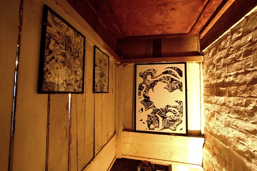
The sketches tucked under the stairs are produced by Hera working on her own, signed under her hand only. Having been trained in the basic tools of art it is no surprise that Hera is capable of these vignettes, finely drawn with incredible economy of line. This illustrates a characteristic of Heras’s art in which her characters have twig like legs and no grounding, capturing a ballerina’s sense of almost weightless floating. Saves addressing the issue of feet which would be handy, guessing here, if your feet weren’t your favourite part of your body.

The sketches tucked under the stairs are produced by Hera working on her own, signed under her hand only. Having been trained in the basic tools of art it is no surprise that Hera is capable of these vignettes, finely drawn with incredible economy of line. This illustrates a characteristic of Heras’s art in which her characters have twig like legs and no grounding, capturing a ballerina’s sense of almost weightless floating. Saves addressing the issue of feet which would be handy, guessing here, if your feet weren’t your favourite part of your body.
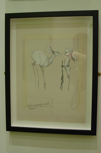
Real Recognise Real
It is perhaps more of a surprise to find that many of the sketches translate so faithfully onto the larger canvasses, where in contrast to the featherlight pencil lines Hera’s painting style becomes bold, loose and extravagant in execution. Compare this sketch with “She Thought She Was Too Cute” above, it seems the demeanour of the girl has changed dramatically from a challenging and defiant “do you worst” to a meek and submissive surrender to what we suppose to be her fate.
She Thought She Was Too Cute
The downstairs installation element of the show is deliberately under-staged with no great drama or over-bearing artiness. The ambience is something of a “below stairs” servants quarters with a very cosy, clubby relaxation space and an old fashioned almost Dickensian clay tiled “no mod cons” laundry room. The washed drips look like collateral damage from laundry battles past, and form a gorgeous extension of the drips in the paintings.

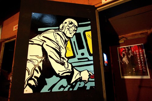
Hood Rats
While “Mom” does her laundry (it is hard to reconcile the Americanism with such an English set-up), Dad seeks respite from the clinical whiteness of the upstairs area to sink into a deep leather chair next to the fire in a homely though slightly distressed chill out zone.
All the work at this show is effectively pre-sold, and is displayed as a collection, each picture being en route to its final lucky owner. With no direct return on the expense of staging this show, Campbarbossa deserves big props for putting on this show.
Whether your preference is for the richness, drips and intrigue of the canvasses or the sparse cleanliness of the sketches it is a pure joy to be able to see the set of works collected together and showcasing one of the strongest talents emerging from the street art scene today. However, if anyone at the show whispers in your ear “that one is mine”, don’t spare their feelings, apply your cricket bat to maximum effect.
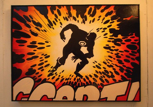
Nine Eleven
A full set of pictures can be seen here though as usual, the low light in some areas challenges the camera (nothing to do with the photographer of course).
In the build up to this show Herakut were generous in their granting time for some conversation, hopefully sometime soon, who knows when - who knows where, there will be a chance to report the fruits of those interviews, you will be the first to know.