
5 – 16 Feb 2009
photos: NoLionsInEngland except donnierobot and Prescription Art where stated
Some Street artists wouldn’t be seen dead at their gallery openings. Some artists grudgingly turn up, mix with their mum and their crew and mumble “cheers my dears, been doin’ it for years”. Some front up with a natural effervescence that just explodes in everything they touch. And they would be jealous of Bortusk Leer’s off-the-scale panache.
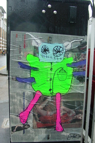
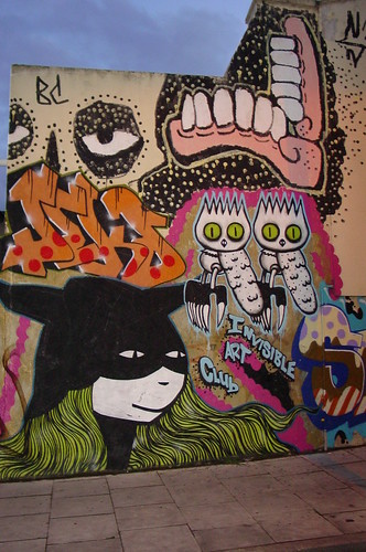
Bortusk Leer’s fluorescent naïve-cartoonish monsters are now a familiar part of the urban decor through-out London’s East End but the street paste-ups are no preparation for the explosion of colour and nursery wackiness that characterises his second joint show, this time with mots-deux specialist Five-Four.
Just to recap, Bortusk Leer started under the Thinkfly pseudonym pasting colourful pigeons on newspaper, morphed into Bortusk with those un-mistakable childish monsters, surprised us with his Supine/Chapman-esque (Jake and Dino, not Mark) defaced vintage prints at his spring 2008 Viola Gallery (dec’d) joint show with Eefos (later to morph into Shuby) then branched his characters out into zany TV quality reality-cartoon montage video shorts and most recently provided regressive urban art affecionadoes with a darts-at-balloons lottery at London’s 2008 Urban Art Awards.
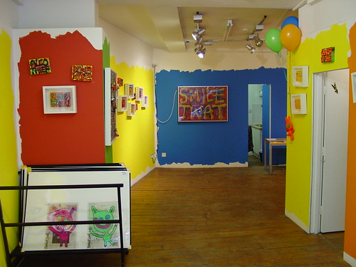
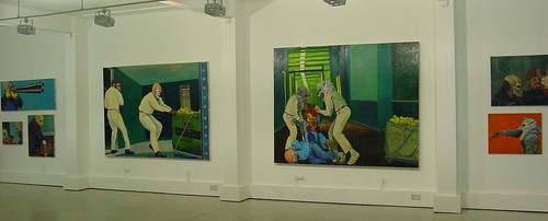
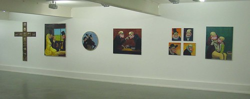
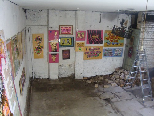
Brick Lane Gallery has been given a nursery make-over to host a primary colour fantasy crèche appropriate to the work of Bortusk Leer.
Photographs from the opening night are worth hunting out, showing Bortusk Leer as his larger then life self providing the kind of entertainment west London parents pay a small fortune to provide birthday parties for their kindergarden kiddies.
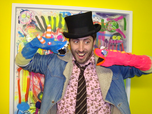
photo: Donnierobot
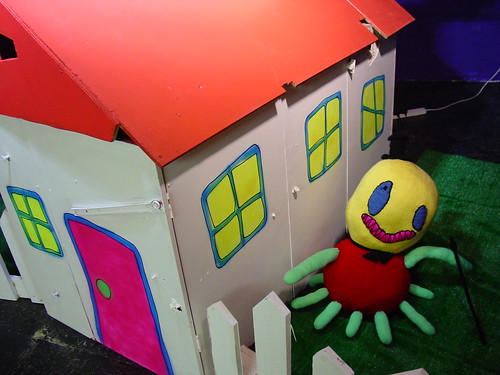
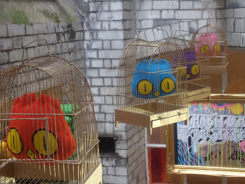
The presence of a wendy house – hang on, isn’t that soooooooooo December 2008? – provides a dayglo habitat for several nightmarish stuffed puppets and assorted characters.
Bortusk Leer/Tony Tagliamenti
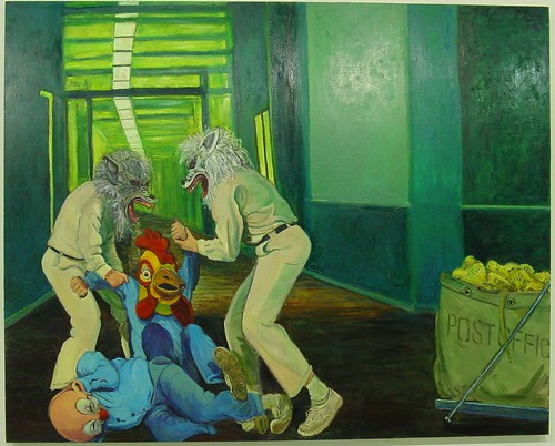
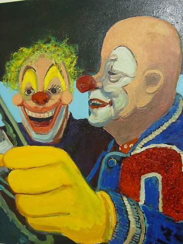
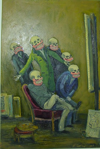
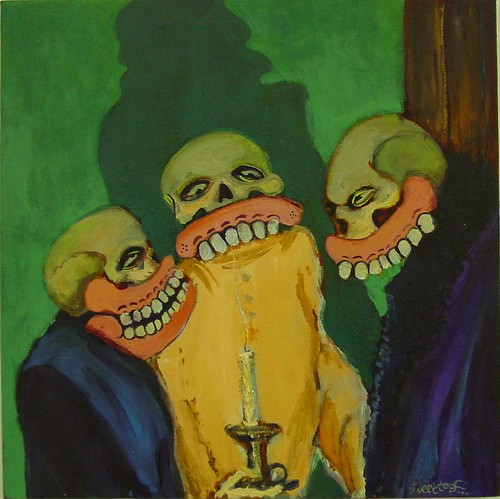
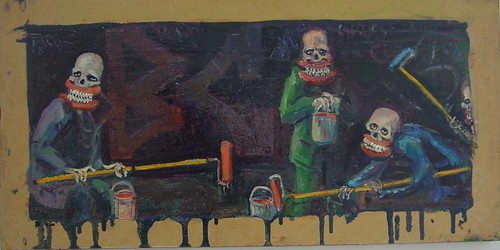
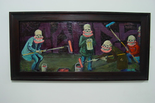
Large canvasses provide a cluttered montage of childhood memorabilia with tightly packed toy plastic toys, imitation pistols and even a number of the defaced pictures complete with frames as seen at the Viola show. Incorporating textured letters, splatters and drips of paint, fragments of tagged wallpaper, sprayed monsters and toy detritus, a Bortusk Leer canvass has everything and the kitchen sink thrown in, though an hour rooting around under a nursery bed might deliver a similar effect.
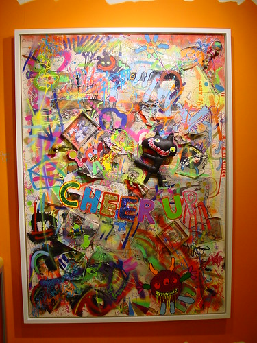
Bortusk Leer: Cheer Up
The wild collision of colours and textures deliver a kaleidoscopic vision of a world seen through acid-fried juvenile eyes.

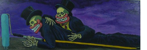
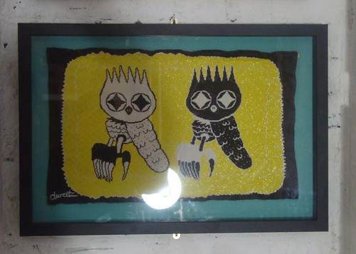
Bortusk Leer: Toy Story (detail)
A shelf of small sculptures resemble an identity parade line-up from a Frankenstein nightmare, showing a scary disregard for conventions of limb functionality, symmetry or compatibility.

Bortusk Leer: The Usual Suspects
The highlight of the show is what can only be described as a Bortusk Leer performance. Aided and abetted by the Muck Cake Sellers distributing grotesquely coloured Styrofoam muffins to the crowds, Leer gleefully beams across the room like the sun has come to a wintery Brick Lane. Infectious happiness and enthusiasm is irresistible, well certainly after a few opening night refreshments it is.
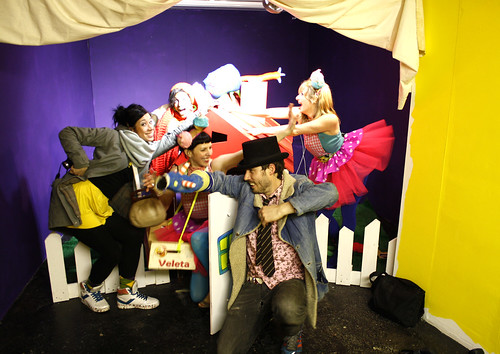
photo: Prescription Art
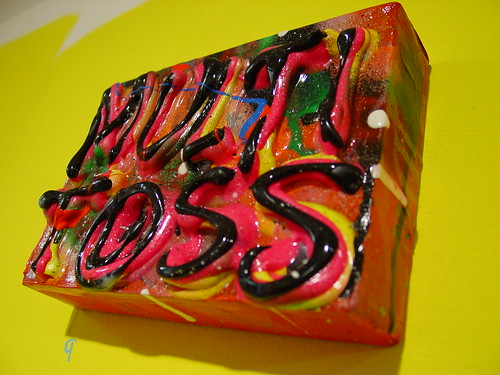
In case you wonder what a Muck Cake is, check the hair bobbles here.
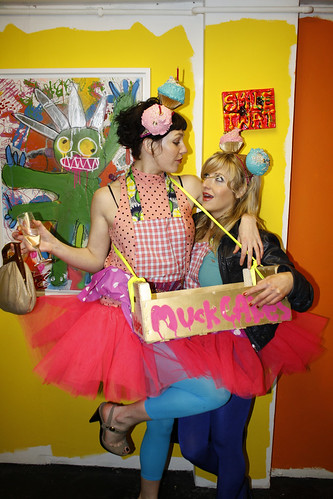
photo: Prescription Art
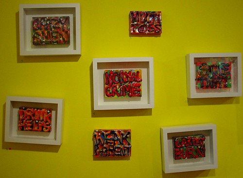
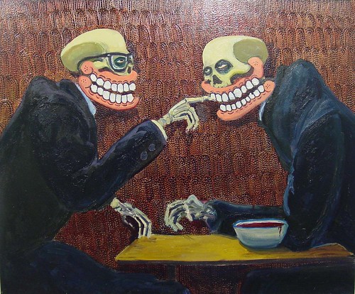
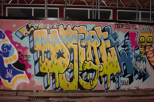
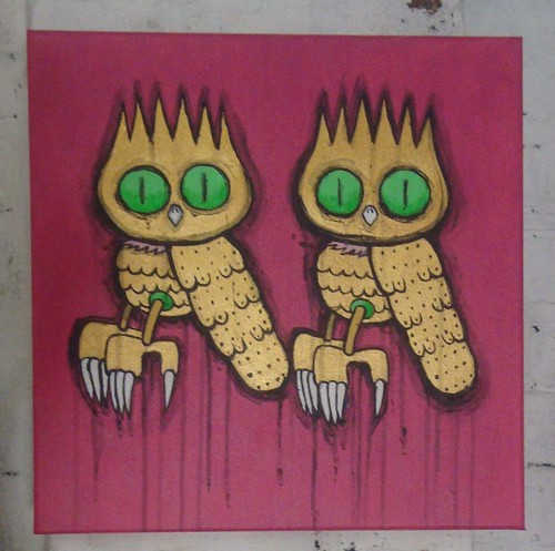
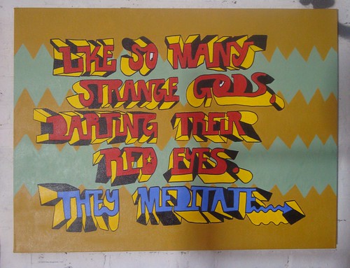
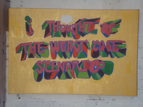
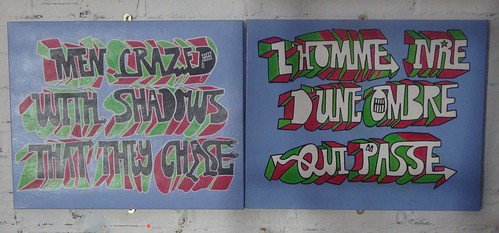
Five Four makes an equally colourful contribution to the show, his oil painted mots-deux on paper collage, squeezed straight out of the tube and left for months to dry on the canvas result in a tubular multi-coloured micro-pollackesque text form. Previously these canvasses used to be left around the streets of London, it was always Five Four’s intention that they should be relocated a happy home.
Five Four
Words pairs are random but the pairings, apart from two exceptions they are pairs, manage to be paradoxical or just plain bizarre. The art though is really in the sumptuous bleeding of colours betwixt the layers of oil. The psychedilia in the colours complements the insane fruitiness of Bortusk.
Five Four
Experiments with lightboxes to enhance the lushness of the colours aren’t entirely successful, areas of white colour look as if a deeper colour has flaked off whilst darker areas don’t allow sufficient illumination to bring out the richness of the colours.
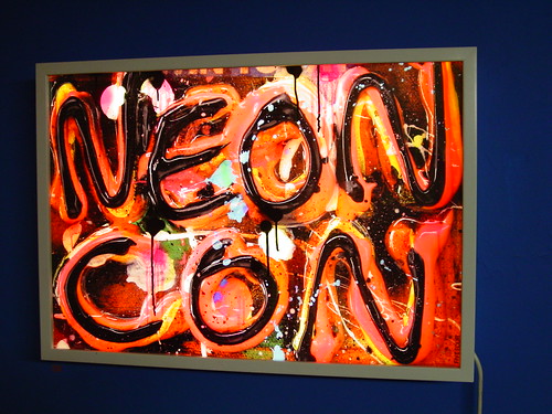
Five Four
You can’t make brilliant art out of shit ideas but strong concepts can build
noteworthy art with even the most rudimentary execution, critics of the child-like stylism in Leer’s work should go to this show to sample the elevating effect the work possesses.
More really great pictures can be seen on the photostreams of Prescription Art and donnierobot.
For more pictures of the art and artifacts, check Bortusk Leer and Five Four


