Showing posts with label INSA. Show all posts

Thursday 29 March 2012

INSA - Self Reflection is Greater Than Self Projection

London Newcastle Project Space
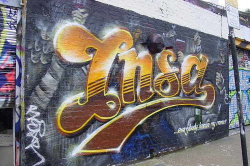
Redchurch St, London

29 March 2012 ONLY


All photos: NolionsInEngland except the proper photograph stolen from Ian Cox


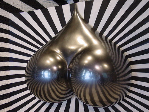
It’s not porn, it’s critiquing porn. That’s the fine line INSA’a one night only installation of chrome, arse and tit straddles.

INSA Room Ian Cox
photo Ian Cox


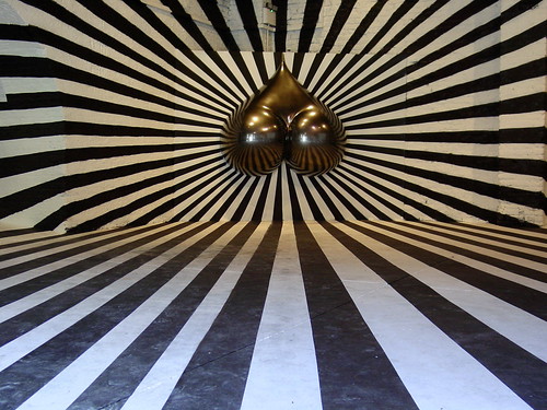
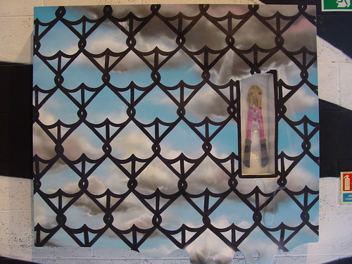
The installation comprises an all-enveloping wallpapered collage of images of INSA chicks photographed reflected in mirror balls. To the voyeur, it’s the hyper contrasting optical distortions that delight the eye most,

DSC_8017 copy


The photographic collage builds from studies (interesting how when it’s INSA, we use "studies" rather than “readers wives shots”) of two pouting females. The artistic concept is raised another power of two as this surround-fetish installation is evidently a collage of photographs themselves taken in an all embracing installation room.

DSC_8043 copy


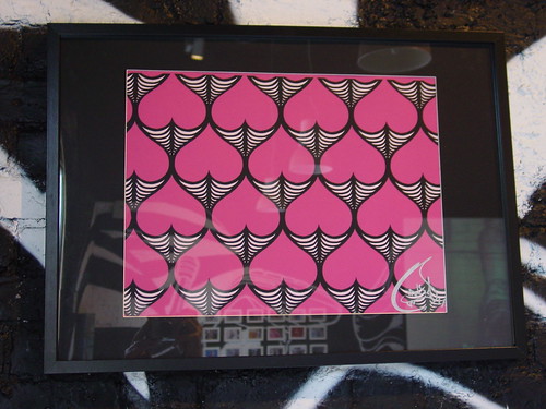
The blurb says something about a Francesca Selby from Papergraphics who donated the digital printable wallcovering, Digimura (www.theartofwallcovering.com). One of the other Graffoto contributors is actually some kind of un-sung global hero in the world of printing bloody big stuff but I can’t be arsed to ask him what this printing technique is; to this author it looks like a distorted colour dottery (whut?) which itself becomes a bit abstract if you try to get to close.

DSC_8045 copy


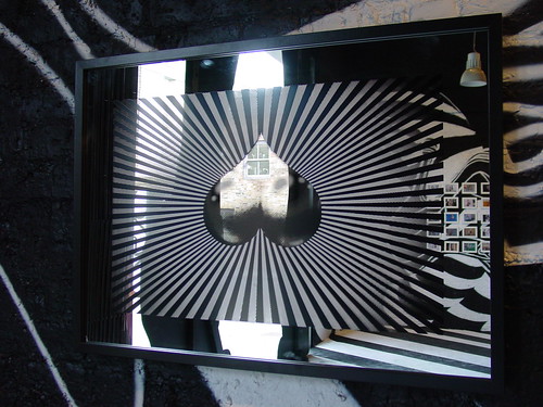
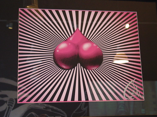
The first 50 fetishists through the door were given a numbered limited edition print derived from the imagery in the show. Usually a free print is so insignificant, so little to write home about that it veers close to a debasement of the artist’s usual quality of work. A bit like getting a Michelin chef’s ready cooked diffusion meal range from the 24hr petrol station down the road. The 42 by 59 cm freebie INSA print given away tonight is undeniably a stunner. It looked so lush there was a hope that it might grace the walls of NoLions Towers but Lady NoLions wasn’t swallowing it.

DSC_8094 copy_edited-1


There is some kind of sick irony in the fact that this all-encompassing immersion art installation is photography based and in itself is magically photogenic. These photographs may not do justice to the trick on the eye in which people appear to be poised perfectly balanced on tanned bootilicious contours.

DSC_8035 copy


INSA’ s signature stripes, flesh and swoosh come together all over the installation

DSC_8053 copy


(Our good friend from Hookedblog reckons that the original shoot for the wallpaper was done in some kind of kinkily dis-orientating strobe flash mode. This explains the intense points of light scattered around the wallpaper, not to mention the ghost tripod in the shot above.)

DSC_8028 copy


The Graffoto photo collection from this show includes a beautifully composed “from the hip” shot of an friend with his mouth wide open, perfectly juxtaposed in front of one of the images so that his bearded mug looks like a carelessly trimmed Brazilian. Unfortunately, such is the way with that kind of “street photography” technique, the pic was hugely over-exposed and will never be published, this will hopefully prevent a generation of young boys growing up with a bizarre idea of where a G-Spot is found. Here is a completely unrelated pic.
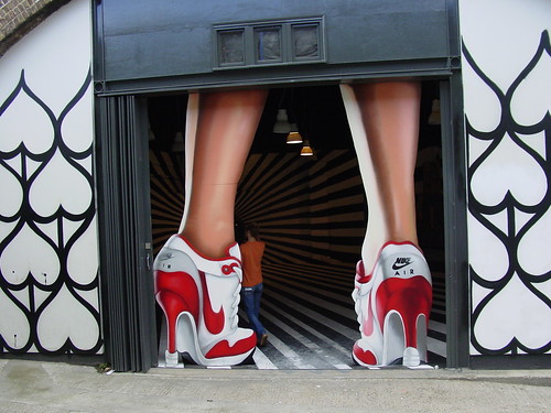

DSC_8015 copy
Arses


Someone cleverer than this author may make a case that a room full of lathered up penises might fulfil the same intended artistic concept but if INSA ever takes that as inspiration to a produce a similar gender opposed installation then you might have a bit of a wait to read about it here on Graffoto.

DSC_8025 copy


DSC_8042 copy

Wednesday 28 October 2009

Heavy Artillery - Haters

Prescription Art Gallery
Brighton, England
22 Oct 2009 -

all photos: NoLionsInEngland


Heavy Artillery, awesome top end graffiti writers have opened their first whole crew show in Prescription Art’s gallery in Brighton. This show takes place in a distressed and dilapidated former music library with scene-of-the-crime tripod lighting, unlit external toilets and no running water, so a graff crew is bound to feel comfortable.


Heavy Artillery Haters


The derelict feel and distressed textures of the large single room floors and cavernous basement create an ideal ambience for graffiti art. Upon entering at ground level the first explosion of colour and elaborate writing comes from three floor to ceiling pieces by Giroe, Gary and Roid. Giroe and Gary look more or less exactly as they would on a street wall, a crisp clean riot of colour.


Giroe - large piece on multiple canvas matrix


Roid’s writing outdoors takes the law of the letter and throws the law away, deconstructing the alphabet to the point of virtual illegibility to all but the most tutored eyes so it is a surprise that for this indoor show he has gone for a less wild word form, making the lettering more legible whilst setting them against a backdrop belching comic style smoke trails.


Gary, Roid – large pieces on multiple canvas matrix


Roid


Another bit of Heavy Artillery info, there are twelve members of the HA crew, 9 of them have work in the show – Alert, Rench and Relay missing. Upstairs the standout piece is a combined mural and installation by HA’s friend INSA. Its centrepiece is a dulled down version of the chrome arse from his “Looking For Love In The Wrong Places” show set into a circular black and white vortex flanked on either side by female posteriors , each caressed by a hand whose nail paint features a mash-up of the classic INSA pink, black and white stripy heels, a pair of which adorned a suitably willowy lady enjoying the show. INSA has enjoyed a trigonometric exercise by creating a visually complete circle drawn across a floor and ceiling each intersecting a half cylinder recess, a interesting multi-dimensional draughting challenge.


INSA – Live The Dream, Feel The Magic


Giroe, aka Jiroe in the world of graff which encourages writers to vary the spelling of their name for greater opportunity to play with letters, has created a multi-media portrait which is mainly spray painted on the wall but the eyes are light up by swirling projected fractals, whilst the teeth change colours in a way that would have dentists taking up drugs. Very psychedelic.


Giroe


Gebes has done the half-height burner on wall and integral canvasses thing, several of the canvasses are filled-in outside the graff outline with fuzzy coloured strips, a motif which re-occurs in Gebes more abstract – give or take the occasional inter-galactic astral carrot - canvasses.


Gebes


Gebes


In the basement HA crew are a touch more focussed on art created for canvas rather than across it. That said, Storm has a graff styled “S” with a faded fill and “Heavy As” tag on canvas which almost looks as if it might have been surgically extracted from a full Storm dub. If graff elements in your home is your thing then this or two other canvasses with HA tags might be picked up for only slightly more than the original release cost of a TOX print.


Storm "S"


Mr Wany has contributed three diminutive canvasses each featuring a single surreal character that share a pinched face appearance with characters often featured Mr Wany’s external walls. Letters are woven into the work both visibly and also in a very subliminal way deeply disguised in the paint, the lettering is so light it has the appearance of vestigial remnants of painted over previous work on the same canvas.


Mr Wany Red Line/W Lion/Alien God


One end of the cellar consists of a dirty wild urban graff tableau created by Odisy complete with discarded cans on the floor, picture the crazy archaeology of colours you get on an illegal wall built up from generations of throwies, tags and characters, all of which can be made out in the aerosol mix. Four large portraits on canvas blend into this backdrop but have been hung tilted from the ceiling about 2 feet forward from the background – Odisy wants to separate his art from the graff.


Odisy


Stepping back from the work reveals the characters as actually integral with the mural behind. The secrets of Odisy’s art alter ego, Alex Young are really kept close to the chest in this show with only one example of his pointilist style tucked away two floors up between INSA and Gebes.

At the opposite end of the cellar, one of the highlights of the show displayed on a rough mural featuring an assortment of his characters are the decks, canvasses and paintings on found materials contributed by Nylon, the second non HA writer and artist to be honoured with an invitation to share the HA love. A particular favourite for its rich colours, heavy paint and rough surface texture is Zulu. In the flickr show set (link below) is another pic showing the lush surface finish to better effect.


Nylon – Zulu


Nylon - deck


Twesh has been full on writing his name on a basement wall in his usual catenary style with outrageous variations in the proportions of his letters, taking one example the word stretches to scratch three canvasses, one pair, a diptych just about embrace a fragment of the “T”, the other feeds off an apparent explosion of particles (Structure 01.mb) blowing into a graphic of modernist architecture.


Twesh


The crowning touch in both sets of canvasses is Twesh’s calligraphy, written in diagonal layers, its curvaceous beauty is almost the diametric opposite to the wanton indecipherability of the graffiti’d name they spring from.


Twesh – detail


Prescription Art has a spectacular space in Brighton with perfect run-down grandeur for graffiti art shows and on all three floors the artists have made great use of the architectural nooks and crannies.


Roid, Aroe


The previous HA show at prescription Art in August was dominated by over sized graffiti names done over a wall and canvass melange and I had hoped to see more of the art skills of these graffiti writers, all of them are accomplished artists outside the graffiti genre. A large burner across a set of canvasses rarely results in anything other than crude fat cap abstracts whose individual composition is almost entirely an accident of positioning within the piece rather any particular artistic intention. Maybe the randomisation is a valid artistic device in itself but there is little doubt that this wasn’t meant as a significant conceptual exercise. Where the crew – and friends – have got out the acrylics and other materials the results have generally been exciting, it would have been great to have seen more of this.


Storm (word and cockerel), Gebes


The show is one for fans of graff and is a lot better for not behaving like it needs to create converts, when graff gets evangelical it tends to castrate itself and make tame, crowd-pleasing adjustments, thankfully Heavy Artillery haven’t felt the need to go down that route. The show title itself comes across almost as a challenge, you hate us and we don’t care.


INSA Heels (models own)


The un-even localised gallery lighting makes photographing this shit a bit tricky, it’s pretty certain that the colours showing up in the flicks are probably not the colours you would see with the naked eye in daylight.

Regrettably with a lot to gas on about this ended up too long to include relevant street pieces. Check out a big collection of the HA street work on Heavy Artillery’s crew flickr.


7th Letter (AWR/MSK crews aka Graffiti Gods, Roid and Aroe are members)


Likewise, Nylon’s stuff here. INSA has a website yer. Finally, this write up contains more photos of HA pieces that it does the art work, check my show flicks here for some more HA art.

Saturday 18 July 2009

INSA – “Looking For Love In All The Wrong Places”

Bateman Row Arches, London
17 – 29 July 2009

all photos: NoLionsInEngland


I’m a sucker for Illusion rooms. From Cept’s mindblowing 3 week individual labour of love in Dalston last year to D*Face’s memorable Haring inspired room at his Apopalypse show, any time an artist gets to indulge themselves in something which is more experience than product, I raise a glass and a cheer.

Entering Insa’s show to find a large part of the space given over to a dis-orientating ultra-perspective black and white illusion room with a pair of chrome buttocks at its’ focal point presses all the right buttons.


Looking For Love In All The Wrong Places


The words Insa and fetish often appear in the same sentence. If you ever come across a website which has sidebar links such as Legs, stockings, heels, booty, candy pink, ankles and stilettos, chances are that INSA has started a porn site based on various favoured fetishes.

But before getting to that, it’s worth reminding ourselves that Insa has awesome skills with a spraycan. At the 2009 London Meeting Of Styles INSA got his name up with nice fades, sharp lines and a perfect facsimile of what since has been found to be the signature tune logo of 80s sitcom Cheers.


Insa 2009


INSA’s warped stilettos have popped up on shutters, walls and boarded up shopfronts in colour (pink) and black and white across Shoreditch.


Insa - 2009


This Escheresque repeated image mural in a suitably sleezly Shoreditch location has been done more than once by INSA. Some people believe the sculpted piece is a heart, they could be right, even the PR company sits on the fence in its printed puffery, describing them as his trademark hearts/asses (which I thought was an animal Jesus rode in the bible. I always have seen these as a pair of buttocks and stocking topped thighs, perhaps I am tuned to the man’s wavelength.


Shoreditch Relief


Evidence of Insa’s presence on the street has even extended to reaches inside windows in derelict slum properties and stiletto paste-ups. Check out Insa’s pieces and production pages on his website (link at the bottom)

Back to the central feature. What is the point of Insa’s exercise? What is the......bottom line? Well, Insa must be aware that the shortest distance between two points on a 3 dimensionally curved surface is a curve. In Insa-world this translates into the shortest between any two points on a lady’s leg definitely being a curve, no matter how straight the seams on her stockings or the bands on the stripey tights may be. No curve shall go un-touched. The point of this work is not the huge display of perspective lines guiding into the chrome buttocks, or the two tone patterns on walls ceiling and floor, it’s about how the chrome buttocks turns those straight lines into curves, how the reflected lines caress the curve of the buttocks and generally about drawing attention to a bit of bootilicious magic, follow the landing lines, hurtle down those tracks and let your fingers trace those curves baby.


Looking For Love In All The Wrong Places (Caution: Objects May Appear Larger Than They Really Are)


The show title “Looking For Love In All The Wrong Places” is not immediately resolved by the work on display except possibly to the extent that the dominant piece of the room shares its’ title with the show. It is left to you to decide why the chrome arse piece should be graced with this moniker.

Of the more conventional framed art on the wall, most interesting is this twist on graffiti culture, where the lines of his repeated booty motif are overlapped to suggest a chain link fence and inside a “break in case of emergency” style box are a pair of wire-cutters, the train yard graffer’s best friend for effective access to secure train lay-ups.


Sunny Sky Over My Favourite Park In South London [blah blah] With Some Expensive Bolt Cutters


The subtle but most extraordinary eroticism of the curves in the repeating motif is most evident in the pink print version, the essential femine curves are distilled down to a simple pop art abstract style.


Empty Aspirations print


Three monochrome mirrored screen prints continue the core themes of the stiletto, the “In All The Wrong Places” arse and the repeating arse, the challenge with each of these was distinguishing the reflection of the black and white illusion room from the print on the mirror itself, these mirrors probably will create a stunning effect in a different coloured room. Say pink for example.


Looking For Love Mirror


The very large legs straddling the opening to the art room (there is an adjacent trainer salesroom or something) make an impression which leaves you in no doubt of two things, firstly Insa’s subject matter and secondly, the corporate logo providing the sponsorship. The humour in entering between the legs is not going to be lost on many and you need to sit outside the show looking in to appreciate how INSA has screwed around scale at the entrance in a “through the looking glass” manner.


Enter between the legs


It is of course easy to get prissy about the supping with the devil corporate connection with some of the work in the show but whatever it takes to give the funding and time to create this temple to the female curve is forgivable.

You might forgive the corporate logo integrated into one of the black and white prints too but I bet you wouldn’t put it on your wall. So, instead of that print, lets end contemplating how Insa manages to take that most effeminate of colours, pink and by combining it with black and white creates the effect of intense masculine fetishism and, here a little fun for the kids, scroll your screen up and down see how the surroundings around the arse throb. It’s what this work is all about.


Looking For Love print


These and a few other pictures from the show here

Insa’s pieces, productions and other shizz here