Tuesday, 3 November 2009

Tinsel Edwards, Twinkle Troughton, Meter Maids!

Irate motorists in Shoreditch and Hoxton took a hammering last Thursday as a blizzard of parking tickets were issued in a blitz on cars in the area. The usual sealed sellophane wrappers warned that it was illegal for any one other than the driver of the vehicle to remove the ticket.


While on a lunch break constitutional Graffoto caught un-expectedly up with a pair of wardens leading the onslaught on parking in the area. From behind there was something familiar and saucy about the cascading black hair, the seamed stockings and the red stilettos and catching up our suspicions were confirmed.


It was Twinkle Troughton and Tinsel Edwards dressed to kill as meter maids – pulses raced I can tell ya, if only real traffic wardens looked like this.


The very realistic cellophane wrappers turned out to contain not a ticket but a limited edition signed piece of mini art titled “It Was The Best Of Times, It Was The Worst Of Times”, featuring a closed UK high street institution, Woolworths.


Loss of jobs, industries and insecurity are a wide-spread reality for millions caught in the recession fall-out yet one senses a ray of hope in Twinkle adn Tinsel's sentiments, a possibility that within the recession people do find the inner reserves to rebuild, recover and grow. Out of the negative coming a positive.

Imagine the shifting emotions of a driver thinking they’d picked up a parking fine only to find they’d actually been gifted a piece of free street art. Again, out of a negative coming a positive.


So there you have it, Twinkle and Tinsel make an event of giving out free art, cheer up at least two wandering wage slaves (Graffoto doesn’t run on fresh air you know) and throw around complex ideas about emotional polarities into the bargain.

Wednesday, 28 October 2009

Heavy Artillery - Haters

Prescription Art Gallery
Brighton, England
22 Oct 2009 -

all photos: NoLionsInEngland


Heavy Artillery, awesome top end graffiti writers have opened their first whole crew show in Prescription Art’s gallery in Brighton. This show takes place in a distressed and dilapidated former music library with scene-of-the-crime tripod lighting, unlit external toilets and no running water, so a graff crew is bound to feel comfortable.


Heavy Artillery Haters


The derelict feel and distressed textures of the large single room floors and cavernous basement create an ideal ambience for graffiti art. Upon entering at ground level the first explosion of colour and elaborate writing comes from three floor to ceiling pieces by Giroe, Gary and Roid. Giroe and Gary look more or less exactly as they would on a street wall, a crisp clean riot of colour.


Giroe - large piece on multiple canvas matrix


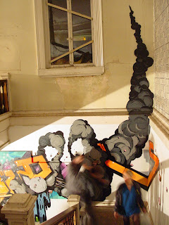
Roid’s writing outdoors takes the law of the letter and throws the law away, deconstructing the alphabet to the point of virtual illegibility to all but the most tutored eyes so it is a surprise that for this indoor show he has gone for a less wild word form, making the lettering more legible whilst setting them against a backdrop belching comic style smoke trails.


Gary, Roid – large pieces on multiple canvas matrix


Roid


Another bit of Heavy Artillery info, there are twelve members of the HA crew, 9 of them have work in the show – Alert, Rench and Relay missing. Upstairs the standout piece is a combined mural and installation by HA’s friend INSA. Its centrepiece is a dulled down version of the chrome arse from his “Looking For Love In The Wrong Places” show set into a circular black and white vortex flanked on either side by female posteriors , each caressed by a hand whose nail paint features a mash-up of the classic INSA pink, black and white stripy heels, a pair of which adorned a suitably willowy lady enjoying the show. INSA has enjoyed a trigonometric exercise by creating a visually complete circle drawn across a floor and ceiling each intersecting a half cylinder recess, a interesting multi-dimensional draughting challenge.


INSA – Live The Dream, Feel The Magic


Giroe, aka Jiroe in the world of graff which encourages writers to vary the spelling of their name for greater opportunity to play with letters, has created a multi-media portrait which is mainly spray painted on the wall but the eyes are light up by swirling projected fractals, whilst the teeth change colours in a way that would have dentists taking up drugs. Very psychedelic.


Giroe


Gebes has done the half-height burner on wall and integral canvasses thing, several of the canvasses are filled-in outside the graff outline with fuzzy coloured strips, a motif which re-occurs in Gebes more abstract – give or take the occasional inter-galactic astral carrot - canvasses.


Gebes


Gebes


In the basement HA crew are a touch more focussed on art created for canvas rather than across it. That said, Storm has a graff styled “S” with a faded fill and “Heavy As” tag on canvas which almost looks as if it might have been surgically extracted from a full Storm dub. If graff elements in your home is your thing then this or two other canvasses with HA tags might be picked up for only slightly more than the original release cost of a TOX print.


Storm "S"


Mr Wany has contributed three diminutive canvasses each featuring a single surreal character that share a pinched face appearance with characters often featured Mr Wany’s external walls. Letters are woven into the work both visibly and also in a very subliminal way deeply disguised in the paint, the lettering is so light it has the appearance of vestigial remnants of painted over previous work on the same canvas.


Mr Wany Red Line/W Lion/Alien God


One end of the cellar consists of a dirty wild urban graff tableau created by Odisy complete with discarded cans on the floor, picture the crazy archaeology of colours you get on an illegal wall built up from generations of throwies, tags and characters, all of which can be made out in the aerosol mix. Four large portraits on canvas blend into this backdrop but have been hung tilted from the ceiling about 2 feet forward from the background – Odisy wants to separate his art from the graff.


Odisy


Stepping back from the work reveals the characters as actually integral with the mural behind. The secrets of Odisy’s art alter ego, Alex Young are really kept close to the chest in this show with only one example of his pointilist style tucked away two floors up between INSA and Gebes.

At the opposite end of the cellar, one of the highlights of the show displayed on a rough mural featuring an assortment of his characters are the decks, canvasses and paintings on found materials contributed by Nylon, the second non HA writer and artist to be honoured with an invitation to share the HA love. A particular favourite for its rich colours, heavy paint and rough surface texture is Zulu. In the flickr show set (link below) is another pic showing the lush surface finish to better effect.


Nylon – Zulu


Nylon - deck


Twesh has been full on writing his name on a basement wall in his usual catenary style with outrageous variations in the proportions of his letters, taking one example the word stretches to scratch three canvasses, one pair, a diptych just about embrace a fragment of the “T”, the other feeds off an apparent explosion of particles (Structure 01.mb) blowing into a graphic of modernist architecture.


Twesh


The crowning touch in both sets of canvasses is Twesh’s calligraphy, written in diagonal layers, its curvaceous beauty is almost the diametric opposite to the wanton indecipherability of the graffiti’d name they spring from.


Twesh – detail


Prescription Art has a spectacular space in Brighton with perfect run-down grandeur for graffiti art shows and on all three floors the artists have made great use of the architectural nooks and crannies.


Roid, Aroe


The previous HA show at prescription Art in August was dominated by over sized graffiti names done over a wall and canvass melange and I had hoped to see more of the art skills of these graffiti writers, all of them are accomplished artists outside the graffiti genre. A large burner across a set of canvasses rarely results in anything other than crude fat cap abstracts whose individual composition is almost entirely an accident of positioning within the piece rather any particular artistic intention. Maybe the randomisation is a valid artistic device in itself but there is little doubt that this wasn’t meant as a significant conceptual exercise. Where the crew – and friends – have got out the acrylics and other materials the results have generally been exciting, it would have been great to have seen more of this.


Storm (word and cockerel), Gebes


The show is one for fans of graff and is a lot better for not behaving like it needs to create converts, when graff gets evangelical it tends to castrate itself and make tame, crowd-pleasing adjustments, thankfully Heavy Artillery haven’t felt the need to go down that route. The show title itself comes across almost as a challenge, you hate us and we don’t care.


INSA Heels (models own)


The un-even localised gallery lighting makes photographing this shit a bit tricky, it’s pretty certain that the colours showing up in the flicks are probably not the colours you would see with the naked eye in daylight.

Regrettably with a lot to gas on about this ended up too long to include relevant street pieces. Check out a big collection of the HA street work on Heavy Artillery’s crew flickr.


7th Letter (AWR/MSK crews aka Graffiti Gods, Roid and Aroe are members)


Likewise, Nylon’s stuff here. INSA has a website yer. Finally, this write up contains more photos of HA pieces that it does the art work, check my show flicks here for some more HA art.

Wednesday, 21 October 2009

Keep 'Em Peeled. . . Or Don't As The Case May Be

As that eternal twat Shaw Taylor used to tell us back in days gone by, onto another twat that needs to be kept an eye out for and had some polite words with.

From Flickr friend eddiedangerous http://www.flickr.com/photos/eddiedangerous comes this annoying story of street art theft - seemingly no one is safe, but currently hardest hit is the currently most active street artist - Kid Acne.


http://www.flickr.com/photos/eddiedangerous/4029576457


Follow through to eddies picture on Flickr for the current discussion taking place, am sure it will grow - but this guy seriously needs a word or two in his shell-like to maybe tell him that we do appreciate it, and we mostly appreciate it being left where it is thank you very much!

For more pics of how great the recent batch of Acne "stabby girls" looked, view my Flickr pics here, Nolions pics here and the Kid Acne Flickr pool here.

Monday, 5 October 2009

Miss Van – Lovestain


Stolen Space, Old Truman Brewery, London
1 – 18 October 2009


all photos: NoLionsInEngland except W10 where noted


Miss Van - Lovestain


In a year which has seen fewer significant international street artists coming to grace the walls of London’s grittier galleries it is a relief to find a major artist prepared to stage a large scale show. Miss Van is renowned for the coquettish femine figures she calls her dolls or “poupees” and throughout this vast exhibition she doesn't scrimp with these gorgeous sultry beauties.


Miss Van - Lovestain


Sightings of authentic Miss Van originals are rare on the London streets and thus far, sadly, no sightings of new street Miss Vans have been recorded. This one from Ladbroke Grove goes back a few years, thanks to W10 for the flick.


Miss Van – Ladbroke Grove c. 2003 - photo W10 (thanks)


Lovestain is partly retrospective and partly new 2009 material and is presented within two separate spaces in the same block within the Old Truman Brewery. The new Lovestain material is in the smaller permanent Stolen Space venue.


There seem to be a couple of recently new twists to the Miss Van style. The first development introduces the rather uncertain show title; a collection of images of pious, angelic and saintly females have been modified to look like clowns, each piece called an Inmaculada. Throughout the retrospective, none of the pieces shown are anything other than 100% Miss Van creations whereas a significant portion of the new material works on an existing image from some other source. An IMmaculada is a Spanish Catholic reference to the virgin Mary’s immaculate conception or, in the more literal interpretation of the Spanish devotion, “without stain”. The English prefix IN quite often in English conveys a sense of negative and opposite, think incapable versus capable, so Miss Van seems to be setting up her show to represent the opposite of the immaculate conception, a celebration of physical love. And you thought it referred to something disgusting didn’t you.


Inmaculada


Anyone else seeing Gene Simmonds in there? The subversion of religious imagery is taken even further in the bastardisation of a religious relief of Virgin Mary, and in this one the Miss Van-isation becomes almost sinister


Inmaculada statue


The second twist is that Miss Van has taken the circus elements seen in the 2008 series “Still A Little Magic” and morphed her poupees into clowns. Not clowns in gay, cheerful make –em laff mode but the sad eyes behind the smile kind of real-clown.


Lovestain 2


Obviously a pretty female remain a pretty female no matter what her mood and the most recent Miss Van poupees have been painted with a darker and meaner disposition yet without losing that femme fatale appeal. The lips are smeared in thick clown make-up a la Robert Smith but the puckering has collapsed and distorted into a snarl. Like the aloof but beautiful Goths you couldn’t approach at school, you can take one of these a beauty like this home but you know she’ll be a silent ice maiden, she’ll sniff at your interior decor, she’ll be expensive and she won’t get on with your friends but you’ll be her slave for life if you can possess her.


Lovestain 7


Present but not as prominent in as in previous work are the flaming straw coloured waterfalls of hair. Although mainly tied up in bobs or hidden under hats, the one instance in the new work where the hair is big, floaty and flaming it becomes a major factor in making Lovestain 5 the show-stopping painting it is, a single melancholy masqued pas-joyeuse sits with a fox to her left and a halo of candles but the hair sets a gorgeous golden tone to the painting and provides the contrast for highlighting for the milkiness of the breasts straining the harlequin corset. Whilst at some point the inner perve was bound to emerge, you’ll observe that no link is being made between the candle flame and the wax candle images and any symbolic connection to the show title. None.


Lovestain 5


Lovestain Retrospective

The retrospective part of the show picks up Miss Van’s story from 2003 with about 40 paintings on canvas and wood as well as a couple of installations. This larger space has hugely un-forgiving top to bottom windows on two sides and the consequence is that the space is a bit un-forgiving for laying out (even Downey’s street sign sputnik looked pretty lost and awkward in the vast truman brewery pampas)


The earliest female figures are less three dimensional, the hair hasn’t become the yellow abundance of the last few years and eyes are part open, almost suggesting an alluring flutter of the eyelids.


Untitled 64 – 2003


In more recent times, the figures acquire a more solid form, colours take a richer deeper hue, the hair becomes hugely significant and in almost all paintings post 2006 the eyes are closed and smudged. Animals appear in the composition, often conventionally as a companion, occasionally as guardians and even as possibly mythical or fantasy based symbolisms.


Flaming Bird 1 – 2007


The fox makes recurs in many on the later retrospective pieces though there is a period through 2007 where the female figures become inter-twined with skulls of horned beasts, both in the canvasses and on a trio of paintings on leather


untitled on leather – 2007


With many of the animals, though they look at first glance like either a fem-warriors battle headdress or dead animal stole, there is something sexual about the way the animals cover and embrace the women, so much so that the viewer is invited to speculate that the animals actually symbolise the male of the species.


Fox Hair – 2006


A significant installation Entering an almost enclosed changing screen under an hanging chandelier draped in flaxen hair, the observer is surrounded by voluptuous semi naked long haired beauties each bearing a single candle, their eyes downcast, they watch over the observer. It is impossible for a man to pick fault with this.


every changing screen should be like this


A retrospective involves dicing with fortune, danger lurks, will people hark back to days when the artist was fresh, vital and bristling, will any particular period be found wanting. No problem with Miss Van though, her style and quality are remarkably consistent and she retains in every painting a subtle but erotically charged appeal. If only she could have painted something on the streets.


Obviously with so much material on display the pictures here are only a fraction of the show, there is a fuller photo set of the new Lovestain material here and there are a lot more pictures of the retrospective part of the show here

Friday, 25 September 2009

Keep It Crap. . . A.K.A Councils Are Bullies!

Further to last weeks premature death of the Brick Lane hall of fame that had started and allowed to continue after the Meeting of Styles event this year, word has reached the Graffoto news desk of underhanded tatctics by Hackney Council in trying to bully shopkeepers into having graffiti cleaned from their shutters.


A Shoreditch shop owner has this week received a letter from the council stating, with somewhat imposed authority that "he must paint his shutter within 14 days of this notice, or legal proceedings will begin" - thankfully he told them to take a long walk off a short plank and is standing his ground, but how many others have received the letter and will believe it to be official, and just paint the shutters out as quickly as posssible? Hopefully not many.

After all, it's not like it's an eyesore:


Whilst it isn't believed that the two are connected - being that Brick Lane falls under Tower Hamlets Council, who to date have been slightly more leanient and forward thinking in their approach to graff and street art (they surveyed local residents and business owners as to whether the art should be allowed to stay) It does leave a bitter taste in the mouth that councils, or housing corporations feel that they can bully people into submission and somehow agree with their small minded belief that buffing these walls and shutters actually makes the place any better.

A word from Bristol graff artists is what's needed here (after the council buffed a LEGAL WALL):

Sunday, 20 September 2009

Banksy Self Assembly Flat Pack Graffiti Slogans

photos: Romanywg and Nolionsinengland where stated

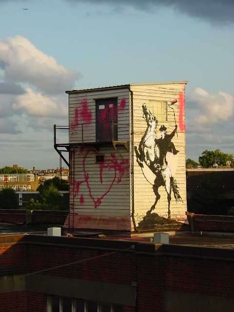
Banksy appears to be getting the limitations of a formal show out of his system by going back to decorating street walls. First the M40 Bandit appeared a couple of weeks ago and is generally accepted to be Banksy although no "official" confirmation has been made.

Banksy
Westway bandit, Nolionsinengland


Now, a very nice stencil has surfaced in Croydon and thanks are due to our friend Romanywg for this pic, there's nothing beats going out on a graff hunt and Mr R spent over two hours and made two trips down to Croydon before finding the right wall.


Flat Pack Anarchist, Romanywg


Stylistically this looks like classic banksy and we've seen versions of the anarchist punk before in "Don't Forget Your Scarf Dear" from the Bristol show.


Banksy vs Bristol Museum, Nolionsinengland


Banksy is noted more than most for his placement and use of the environment, it’s hard to see the full context from the pic here but apparently it is close to the Croydon shop-in-a-barn-on-the-outskirts IKEA. With a nod to someone off a forum for the research, apparently IKEA in Canada jumped on the guerrilla marketing bandwagon and hired an agency to go out and spray un-authorised advertising on walls using, errrrrrrrrrr, “chalk paint”. So Banksy hits two birds with one stone in this piece – convenience weekend anarchists and the appropriation of street cool by mega multi-national corporate.


Romanywg


No obvious explanation for the “IEAK” spelling, Graffoto certainly doesn’t subscribe to the theory that Banksy is afraid of breaching trademarks. I’d like to think Banksy has suffered the living hell that is Ikea’s Returns Desk and this is his jest at how often IKEA stuff is defective.


Some Assembly Required, Romanywg


Some have said this lacks the sense of "Banksy spectacular" but Banksy is fundamentally a street cartoonist and this is up to his usual standards. If spectacular means CCTV Nation or the Pollard St line painter then give me these illegal (guessing) ones any day.

As an aside, K-Guy also had a pop at the homogenisation and corporatisation of art as flogged by Ikea, described here.

And just in case you hadn't heard, Banksy did a popular show in Bristol this Summer, the Graffoto review is here and the Graffoto guide, which like everything else in Graffoto is of immense historical importance but actually bugger all use today, is here.