Sunday 4 April 2010

Alex Young "Portraits Of Alter Egos"

Westbourne Studios
Acklam St, London W10
April 5 – May 10 2010

all photos nolionsinengland


Graffiti artists need a lot of skill to make a successful transformation to canvas. Alex Young’s new outing at the London Miles gallery shows him using not just a completely different non-graff skill set but also strong ideas too.


Tat Escarriot


Young pursues a pointillist impressionism style and skews the composition, adding inverted and blended multiple images.


Stitch


Dots become drips and dribbles. In this canvas below the drips flow up and down the surface.


Latex


Although the subjects have a kind of goth appearance, it isn’t really important to know whether the brief character biogs accompanying the pieces are fictional or real life. Kitty Cutthroat, mild mannered daytime tea-drinker, burlesque glamour model by night; Kitty Peel, circus performing trapeze artist and pharmacist, if they aren’t fictional Young would be guilty of cultivating and showing off trophy cool mates. The clue to the answer lies in the title of the show.


Kitty Peel


These photos don’t do the luscious tones and textured surfaces of the work, don’t be fooled into thinking they have all the life of flat giclee prints. The other photos also fail to convey the size of the paintings, perhaps a few "contextual" gallery shots would have helped but they'd be full of Vyner St First Thursday trendies.


Jane Doe


YT is an un-reformed indie dinosaur with no inkling of scratch or mixing music but the DJ furiously working away on the decks kept up an impressive set of choons. London Miles have found a novel strategy of launch viewing for one night out in the heart of East London’s “First Thursday” circuit then transferring to their Westbourne Studios location off Portobello Road.


Glam, Kitty Cutthroat


A great show with some classy art pieces, how Odd(isy).


Escarriot


All usuable photos taken at the launch viewing are shown in this little write-up, if Graffoto gets the chance to pop along to Westbourne Studios during the show’s run then more photos will possibly appear in the flickr set.

Friday 2 April 2010

Banksy v Robbo - War Continues

.........Or does it?

Are these latest changes by Banksy or not? Opinion in the Graffoto bunker has been divided. Can’t say that passions rose to anywhere near bloodshedding levels though.

All the changes basically involve buffing the Team Robbo wording, tidying up and re-working the defaced images.

The Waiter rat has changed to this, little more than buffing out the Team Robbo words, which is ironic as Graffoto likes to imagine Team Robbo left the stencil intact because it was pish anyway and sufficient embarrassment to Banksy itself.


"I don't Believe in Global Warming/War" has been buffed and replaced by a well executed roller headed flamingo, witty for the proximity of London Zoo with its well stocked flamingo pond. Is the perpetrator saying any bird brain could have done the Team Robbo effort?


Fishing boy has caught a no fishing sign and the Team Robbo tagging has been removed, ok, so its funny but not brilliant. The stencilled fish has a weird white dot and dribble from its tail, either this was a deliberate bit of the art in which case what the fuck is it, or it is a complete accident and would definitely suggest this wasn’t a Banksy. If this had been done by Banksy, wouldn’t the drips of canal water present in the original fishing boy have re-appeared?


Finally and utterly predictably, the King Robbo painter is now FUCKING ROBBO, a modification forecast on many forums and flickr comments. It’s done well but all of the other modifications have basically eradicated evidence of Robbo/Team Robbo rather than provoke him, its intent doesn’t seem to fit with the pattern of amendments to the other canalside pieces. Also, the tagging has been completely removed from all the other pieces but on this one the “Team Robbo” tags survives.


Perhaps the flamingo and the No Fishing boy might be Banksy but the other two look more like the efforts of some adventurous and over-sensitive disciples of Banksy. But wtf do we know?


If you need to read more about how the story started, it was covered by Graffoto here.


Robbo got the hump for reasons described here and a Team Robbo reaction kicked in with the wallpaper graffiti roller being taken back.

More details on the Team Robbo crusade against Banksy as it progressed were covered here and here.

2014, sadly..  Robbo RIP

Sunday 28 March 2010

Remed, Grems, Zbiok, 3TTman - The New Fantastic 4

Pure Evil Gallery, London
18 March – 5 April

Photos by nolionsinengland except pure evil where stated


Superheroes gain un-human powers and infinite energy from all kinds of sources but rarely do they apply them to a good deeds and art combination. 3ttman (Madrid), Grems (Paris via London), Remed (Lille), and Zbiok (Wroclaw) aren’t just the most impossible combination of alpha-numerics to trot off the tongue, they are the latest artists to arrive at the Pure Evil Gallery, summonsed by Daphne Polski to combat the evil Tacoman.


The evil Tacoman has a dastardly plan to destroy every other street artist in the World, the Fantastic 4 have chosen to accept the mission to fighting back on behalf of spraycan users and art punks everywhere. The combat starts with a chase across the rooftops of London.


London Rooftop – 3TTman, Grems, Remed, Zbiok, Pure Evil


Tacoman eventually lures them back to his hideout where the Fantastic 4 indulge an orgy of wall cartoon art and ...... well, rather than spoil the ending, check out the comic which comes with the show illustrated by the mental pental 4-some. Hardcopy is available from Tacoman’s lair which in your dimensions doubles as Pure Evil’s gallery or download here.


The New Fantastic 4 in Tacoman’s basement


By day, Tacoman turns into comparatively mild mannered Pure Evil, an accidental gallerist whose guiding anti-philosophy might be “no control” and in Daphne Polski he appears to have found a soul sister as curator. Daphne has conceived a theme based around 4 dashing superheroes, though by her own admission “it was just a funny excuse to make them get together because they fit so much together”.

Such prominence as 3TTMan has in the UK will mainly have come from his Bear Gardens building makeover as part of Tate Modern’s 2008 Street Art walking tour.


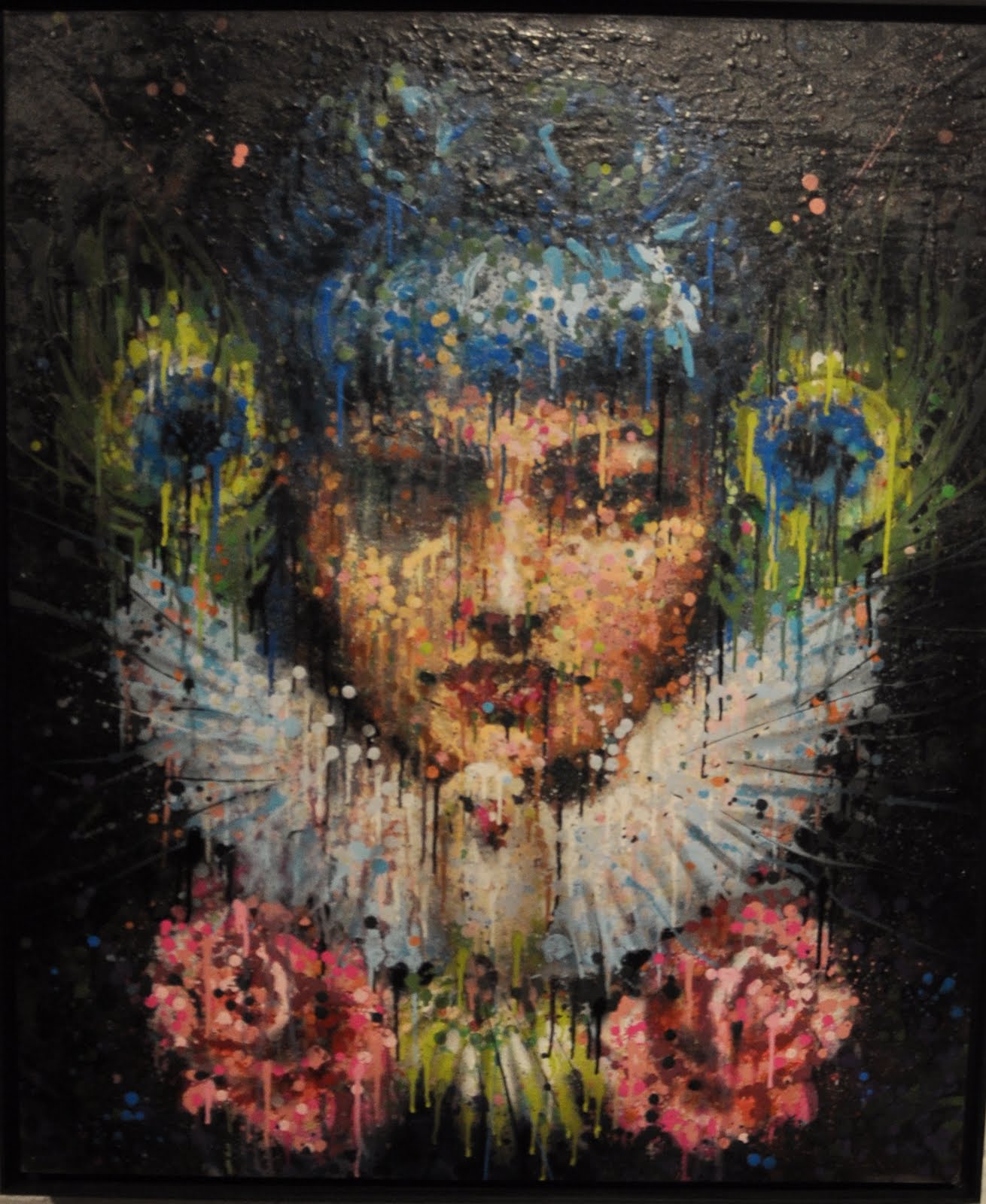
Tate Modern Street Art (detail) - 3TTman


In this show he presents a cycle of 6 canvasses depicting the stations of the cross, primarily a Catholic cult. Ever the modernist, 3TT has chosen the hardcore more literal progression of the story adopted in 1997 in which the stations are more formally based on the writings in the gospels, rather than the looser more myth embellished version that was followed until John Paul II continued his drive to strip the fun out of religion. 3TT has executed these in his very lurid and anti-classical style combining symbology, cubism’s fragmentation of planes and rough drawn comic-ish characters.


Jesus In The Garden Of Gethsemane - 3TTman


The Stations of the cross are typically displayed in chronological order around a church mosh pit to tell the story of Jesus on the cross to a congregation who couldn’t read but knew to fear an inquisition. 3TTman updates the telling of the story reasoning that people have become familiar and jaded with the old conventional renaissance style of telling the story and developed blind-spots to the powerful story being told. He wants to motivate a re-engagement similar to the kind of interest in religious traditions that afflicts visitors to a foreign country.


4 Peter Denies Jesus – 3TTman


In the 4th station, Peter hides in the garden behind a wall where several passers-by accuse him of having knocked around with Jesus, his hands cover his eyes as in one mind he is hiding from his betrayal but in the other knows this is the betrayal and shame Jesus foretold, and as predicted the cock crows three times. That “other mind” comment may seem a bit bizarre but 3TTman often uses multiple heads to represent the spectrum of personalities present in each person, his cartoon alter ego “The Thing” appears in one of the canvasses as a 3 headed brick shitting being (see also the roof battle and the comic).


Brick A brac aka “The Thing” - 3ttman


Super-powers come in many imaginative guises but we shan’t go into the force-of-a-brick-shitter thing.

Remed hangs three gorgeous cubist inspired canvasses conveying the idea of human emotions on the up, a sense of bright positivity with improvements from poor to good or, as in the pair below, from Desire to Fulfilment. In the canvasses Remed blends flat colours into crisply delineated geometric triangles, tubes, eyes and hearts with many of the shapes forming part of more than one feature at the same time. Citing influences such as Picasso, Mattisse, Ferdinand Leger, Basquiat and Carlo Zinelli, Remed uses colour in bold blocks and confident patterns to create sumptuous and fascinating compositions.


From Desire – Remed


To Fulfillment – Remed


Remed and 3TTman go back a long way, in fact to when Remed was 17 and a conviction philistine who believed colouring in was for girl. Drifting around wondering what to select as an additional course element, the 14 year old 3TTman suggested doing a 1 hour a week art lesson. The scales fell from Remed’s eyes when he chanced on a book of Modigliani pictures and for the first time art spoke to him.


Fusion - Remed


Although all four artists knew eachother before, the only example in this show of prior collaboration is Remed and 3TTman’s ambitious re-working of El Bosco’s (Hieronymous Bosch) fifteenth century Ship of Fools. The original fools in the boat included drunken idiots, a priest and a nun beset by food, wine, lust and simplicity. Remed and 3TTman preserve the form of the original painting but update the temptations to a very internet age set of immoralities including lurid sins of the flesh, drugs, greed and errr fast food set in a violent acid drenching of colour


Ship Of Fools - Remed and 3TTman


Grems is a fascinating multi talented rapper, DJ, graphic artist and graff monster, which makes the illustraterly cityscape drawings rather disappointing. The landscape s appear semi fictional, you’d know Paris because there is that big mast they have been proud of for a long time but the painting captioned “London” appears to have no recognisable landmarks connecting to our metropolis, other than the common elements of buildings and a river. Indeed, detective work reveals two parallel rivers, as if a river had split and was flowing around an island, wonder where the Paris born artist might have got that from?


London - Grems


Zbiok is known to many as a long standing Pictures On Walls artist (you’ve got to laugh at PoW listing the show as “Zbiok and others”). Zbiok has a background in graffiti and punk, he chooses to create a sense of youth culture and youth interaction in his painting. For him the process is as important as the end result and he professes to enjoying the physical combining of paints and creating of layers. True to this, all three paintings are naive or primitive figurative compositions featuring youths hanging out, smoking, skating and seemingly on the edge of creating trouble.


Antifa - Zbiok


Need Some Change - Zbiok


Giving a bunch of boys alcohol and pens inevitably leads to comedy cock sketching and the collaborative sketches worked up in situ would have benefited from a little less genitalia but the sketches do exhibit the artist’s calligraphic skills. Remed and Grems’s debt to the Brazilian graff form Pixacao stands out.


The Reallusionist – Remed, Grems, 3TTman, Zbiok (photo nicked from Pure Evil)


The New Fantastic 4 - Remed, Grems, 3TTman, Zbiok (photo nicked from Pure Evil)


In summary, Remed eye candy and 3TTman story illustrations brighten a show which will remain in the memory for the fun elements based around the accompanying comic and some mightily impressive rooftop mural work.

More photos of art from the show and the outdoor and indoor walls paintings here

Thursday 25 March 2010

Warped and Pieced - Return to Huncoat (Part 3)

Back in July 2009 I wrote a piece about the graff co-existing with the rubble of the old Huncoat Power Station in Lancashire. Join me for the final return visit and a visual ride into them thar hills...


All photos by shellshock


Quick link to the July 2009 blog……

Quick link to Part 1 of this blog....

Quick link to Part 2 of this blog....


The disused power station at Huncoat (between Accrington and Burnley) is easily the best hidden graff den I’ve ever been to. Rubble and crud are everywhere, right next to stunning pieces from the Trans Pennine Nomads (TPN) crew (and a few others). A visual overload; you don’t know where to look (actually I do know where to look….. look up for graffiti… and look down for that pit full of glass and old shoes that you are about to fall into you spanner….).


In February I finally summoned up some enthusiasm to get out of Manchester and bob back up to Huncoat (see part 2 of this blog). Due to the snow and my own internal GPS system going strangely loco [Pryme later described it as a “schoolboy error” - lol], I didn’t manage to get down to the other spot, so I went back a week later after arranging to hook up with the fabulous Mr Pryme himself.

Pryme had been painting with TeaOne from Preston (check out TeaOne on flickr) the day before, and he wanted to finish off his own piece, so we yakked whilst he tried to perfect his side of the wall.

TeaOne's piece.....


Pryme in action.....


I probably put Pryme off, because he ended up not liking it and going over it a few days later with a chrome and black number (watch out for a 'Chrome & Black' blog coming soon-ish...)

We then went off to the other spot where back in brassic January Pryme had been doing a lot of work with Burnley writer, Slack - a name I previously didn‘t know. Yes, these pieces (and they genuinely can be called masterpeices!) were all being done outside in the coldest winter for years, when many writers are still hibernating! :-)

Check out Slack on flickr

Check out Pryme on flickr


The whole wall looks great, including this first piece, the most ‘traditional’ of the three, and one that looks extra sweet when cropped down to just the wall itself.


Everyone loves a good chrome and black don’t they (it’s like a friend who makes you smile, or a musician that makes you gasp; it‘s the comfort blanket of graff…) and this is one of the best I’ve seen, with a really effective idea of having two cut-outs of how a colour piece would look.


And last but definitely not least, this peel-back style had writers everywhere wondering why they hadn’t thought of that before.... Genius!!


Tuesday 16 March 2010

Matt Small, Zac Walsh – This Is Us joint show

Signal Gallery, London

11 March – 1 April 2009

all photos: NoLionsInEngland


Londoner Matt Small, nominated for the BP Portrait award in 2001 shortly after graduating from the Royal College of Art, has a compact and colourful joint show with Manchester boy Zac Walsh at Signal Gallery in London.

Matt Small has been a darling of the street art aficionados though if it wasn’t for the urban grime suffusing his work that might be a puzzle as he never works on the streets. Over the past three years Matt has shown extensively in the specialist street art galleries, predominantly Black Rat Press and the late lamented Leonard Street Gallery.

In the previous shows the dominant subject has been the human face. Matt is well known for taking his inspiration from the anonymous citizens who shimmer briefly across his vision and through camera lens before passing on with their lives, usually unaware of their subsequent immortalisation in the distinctive riot of colours which give his portraits contour and expression.


Kaz, found car bonnet, BRP show Mar 09.


Back in 2007 Matt Small gave an amazing demonstration of how he works on flat surfaces, mixing oil based and water based paints then dragging the immiscible colours around the canvas, creating beautiful portrait from the violence and chaos of the squirming liquids.


Leonard Street Gallery live painting, Nov 2007.


The key pieces in this Signal Gallery show are undoubtedly the trio of urban landscapes. Paradoxically for someone so strongly linked to portraiture, these micro communities are actually devoid of human beings though not necessarily lacking humanity.

“These landscapes are from my journeys around town. I find there is something beautiful about these estates. You can walk through them and think they look horrible, you never see anyone but in each house there is a drama going on, there are thousands of lives being lived, there is a lot more than just the outer walls.


London Estate 2, Matt Small


In creating these Matt has used basically the same technique to mix and apply the paints on the metal, the effect is a vibrant colour and windswept motion to the essentially static subject. The pock marked surface of buildings seethes with life reflecting the hidden dramas contained within.


London Estate 3, Matt Small


Whilst London Estates 2 and 3 are essentially 2D paintings, in London Estates 1 Matt has transplanted a meccano styled system of layered laminar deconstruction used in creating some of his 2008/09 3D portraits. This creates a sense of depth and perspective and yet at the same time conveys the kind of down to a budget cheap as chips utilitarian contruction found through-out the 50s and 60s council block estates.


London Estate 1, Matt Small


The canted expanse of grey metal at the bottom of the painting gives a phenomenal depth to the tarmac foreground. The side view below illustrates the complexity of the geometric transformations Matt Small has performed to achieve the incredibly convincing relief effect when view head on


London Estate 1 (detail), Matt Small


At Mutoid Waste’s One Foot in The Grove 2009 show under the Westway, Matt Small took advantage of the bleak blasted concrete walls under the fly-over to preview a completely new style, face portraits created in relief on concrete. There portraits are created using a mould to achieve the basic relief form then cutting lines into the cement surface before it sets.


Concrete Relief Portraits, One Foot In The Grove 2009, Matt Small


The Mutoid editions which were coloured using a simulated tagging (never going to please graffiti writers that one), responding to the space which has legendary status as the UK’s first graffiti hall of fame whilst referencing to the cultural background to the world these kids inhabit. For this show the concrete is sepia toned by the trademark explosion of colour is absent, which seems to emphasize a kind of aboriginal featuring in the portrait which hadn’t really been obvious before.

"I like the surface effect giving the feel of age and texture. I love the idea of materials that you find in the street, cement and metal, it's another way of appropriating what we see in our urban environment"

Unusually, this triptych places the portrait face into a housing estate background.


Jason, Matt Small


The sense with Matt’s larger shows has been an almost intimidating and overwhelming press of faces, crowding in on you from their car bonnets and dismantled freezer carcasses, so many bodies exerting claustrophobic intimidation that you feel you need an escape. This time the increased variety and quality, inversely related to the reduction in quantity has allowed a fresh appreciation of Matt’s work. With a grand total of 5 pieces in this show Matt demonstrates the broader themes and techniques his work is exploring these days and with these has staked a claim to be one of the (few) truly important artists to come out of the urban art scene.


A Matt Small show couldn't be the complete experience without at least one piece looking like a deranged madman was let loose in at scrapyard with tubes of paint


Darnell, Matt Small


Zac Walsh

Zac Walsh and Matt Small have known eachother since Royal College of Art days in the late 90s and as the friends both work in portraiture it isn’t too wild a leap of imagination to see how a joint show can make sense. Stylistically Zac brings a much cleaner and rich finish to his work. The works were created when Walsh was invited by the Holland Park Opera to attend operas, a new experience and to paint a reaction to the dramas. Zac wasn’t a fan of opera but was inspired by the geniuses creating the opera and the complexity of the narrative and staging.


Francesca Da Rimini, Zac Walsh


In Don Giovani, Walsh reacts to the controversial ending where Don Giovanni gets dragged into hell. The figure at the centre of the painting is the artist and the statue of the Commendatore which drags him to hades comprises stone grey coloured photo collages of Walsh’s own forearms. The circles in the middle of the horns are Dante’s map of hell and the drama is set against the background of a crucifix. A lot of the opera’s symbolism gets onto Walsh’s canvas.


Don Giovanni, Zac Walsh


Whilst the characters depicted come from the opera, Walsh has used close friends as the models giving the artwork a personal relevance as well as a lesson in dealing in people’s egos (“my thighs aren’t that big!”).


La Forza Del Destino Zac Walsh


The pictures combine photo collages with a very saturated colouring in the painting, not to mention the occasional bit of spray paint. A knowledge of opera isn’t essential for the interpretation of Zac’s painting, suffice that the evident richness and classical beauty permits the paintings to stand up to the un-snobbish scrutiny of the non-opera buff.


Fidelio, Zac Walsh


Pelleas And Melisande, Zac Walsh